
🔒 Case Study
Enter access code
to view this project
Incorrect — try again.
You've got the eye for it.
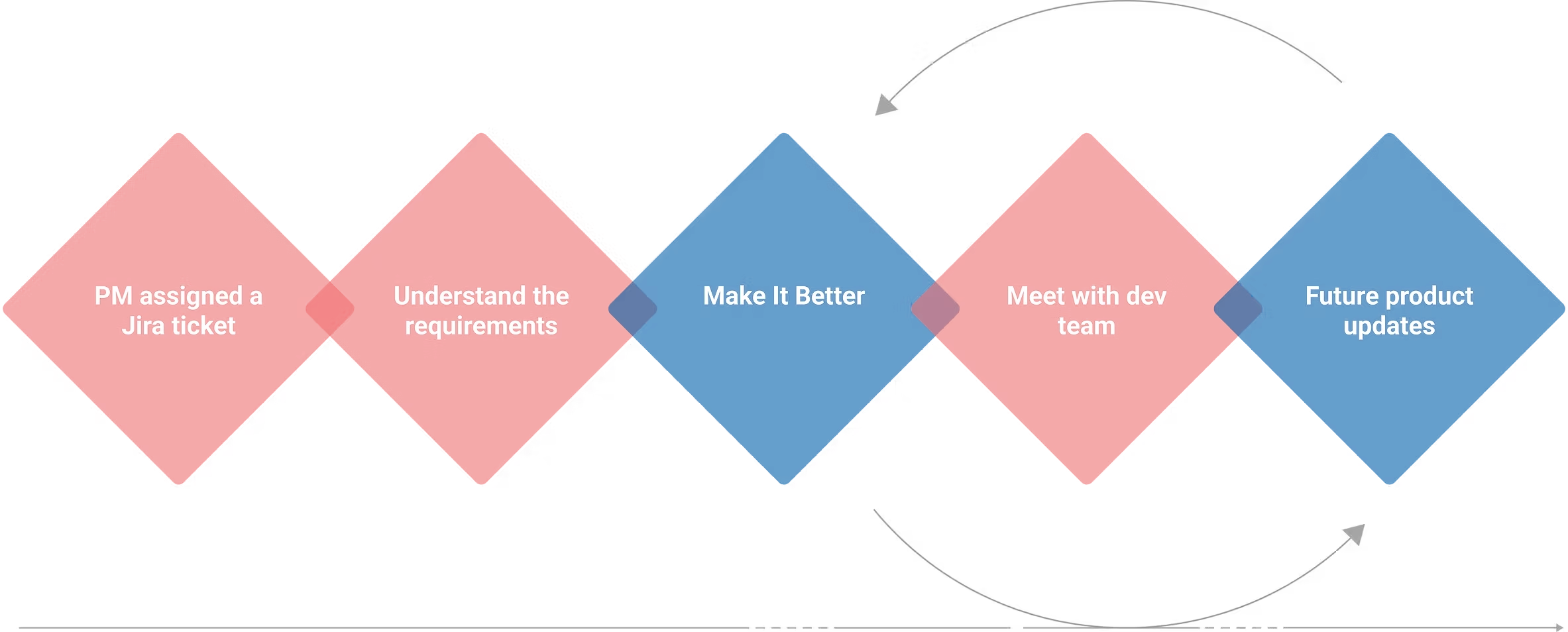
Open Communication Channel ✈️Designed end-to-end landing, enrollment, and onboarding for Fiserv’s SMB cash management suite.
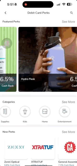
Led the 0→1 design of a debit card perks program, driving activation and daily engagement across 1M+ users.
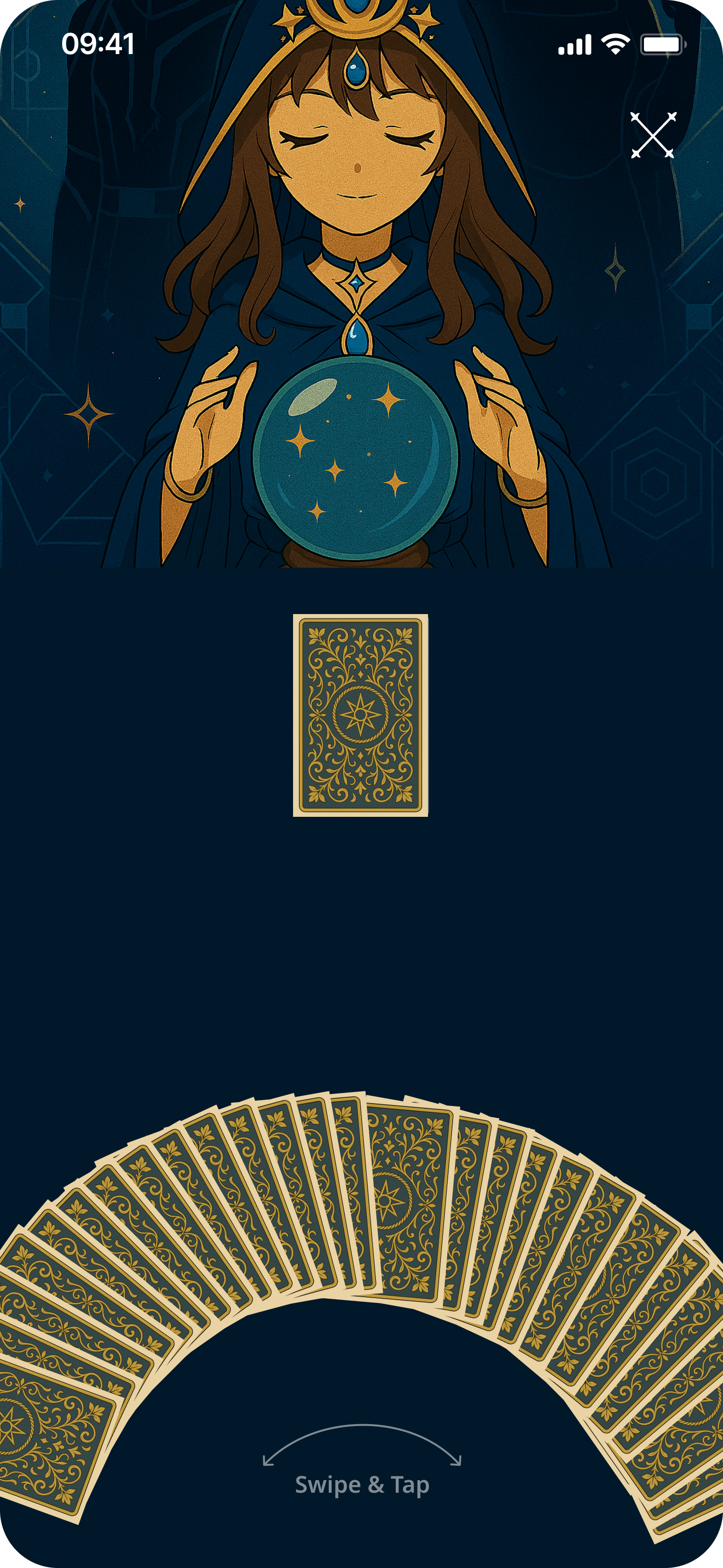
Gesture-first tarot with dual visual themes and a collectibles system built to make every pull a ritual.
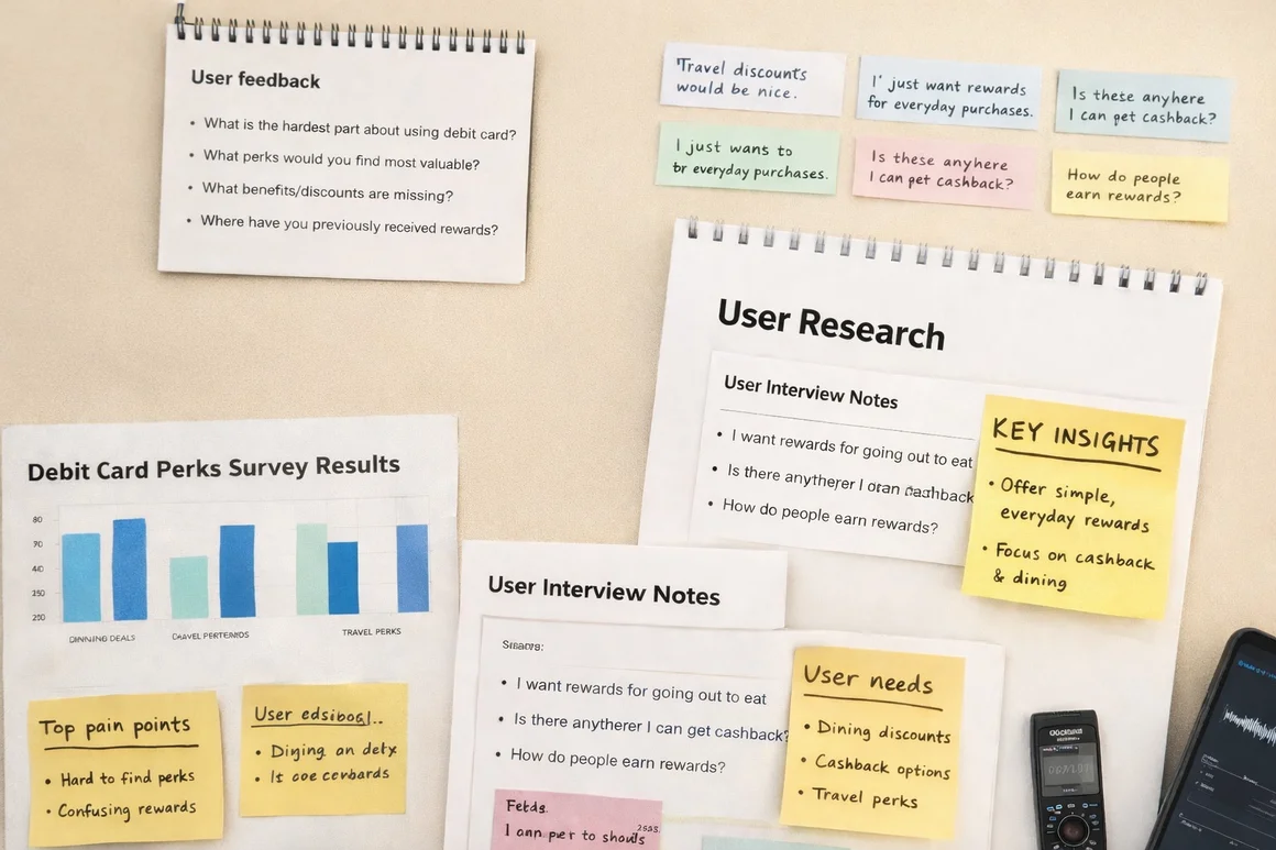
End-to-end user research study uncovering critical usability gaps and reshaping the product roadmap through moderated sessions.
Designed and launched a social discovery platform combining research, interaction design, and promotional video production.
About
Former Senior Product Designer at East West Bank (Velo Digital), where I led design initiatives and crafted seamless experiences across native mobile, online banking, and web platforms.
I focus on creating minimal, elegant interactions powered by emerging technologies — with a portfolio spanning fintech, AI, and aviation UX. Beyond design, I'm a pilot in training, driven by curiosity and fresh perspective.

Get in touch
Whether it's a product, a system, or something no one's designed before — I'm ready to collaborate.
Say Hello✦ UX / UI Case Study
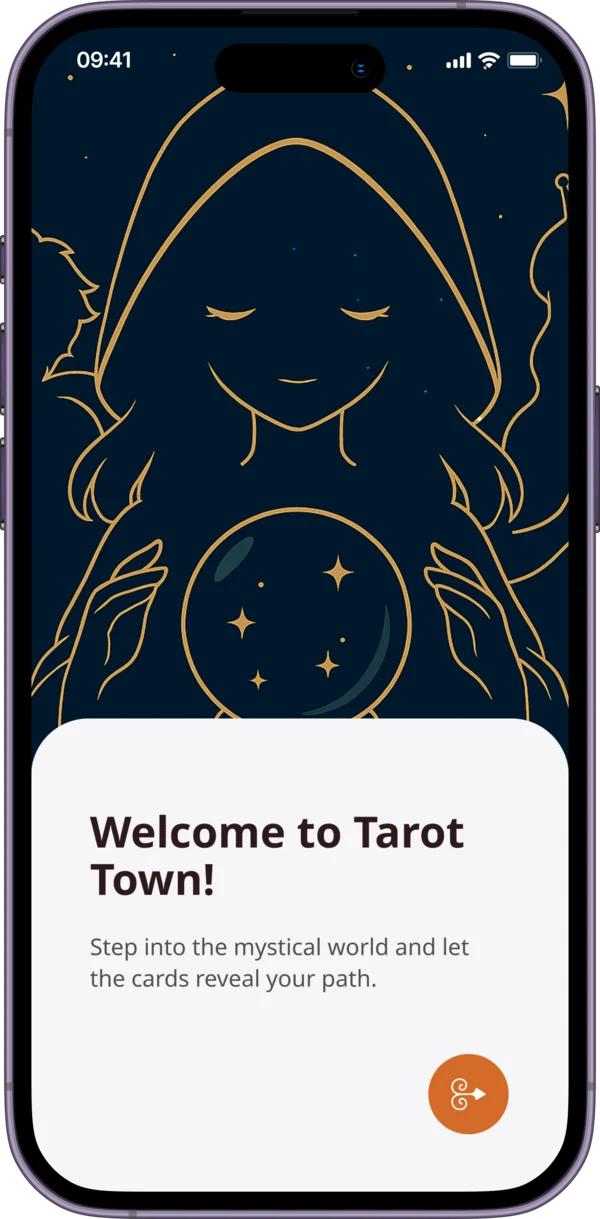
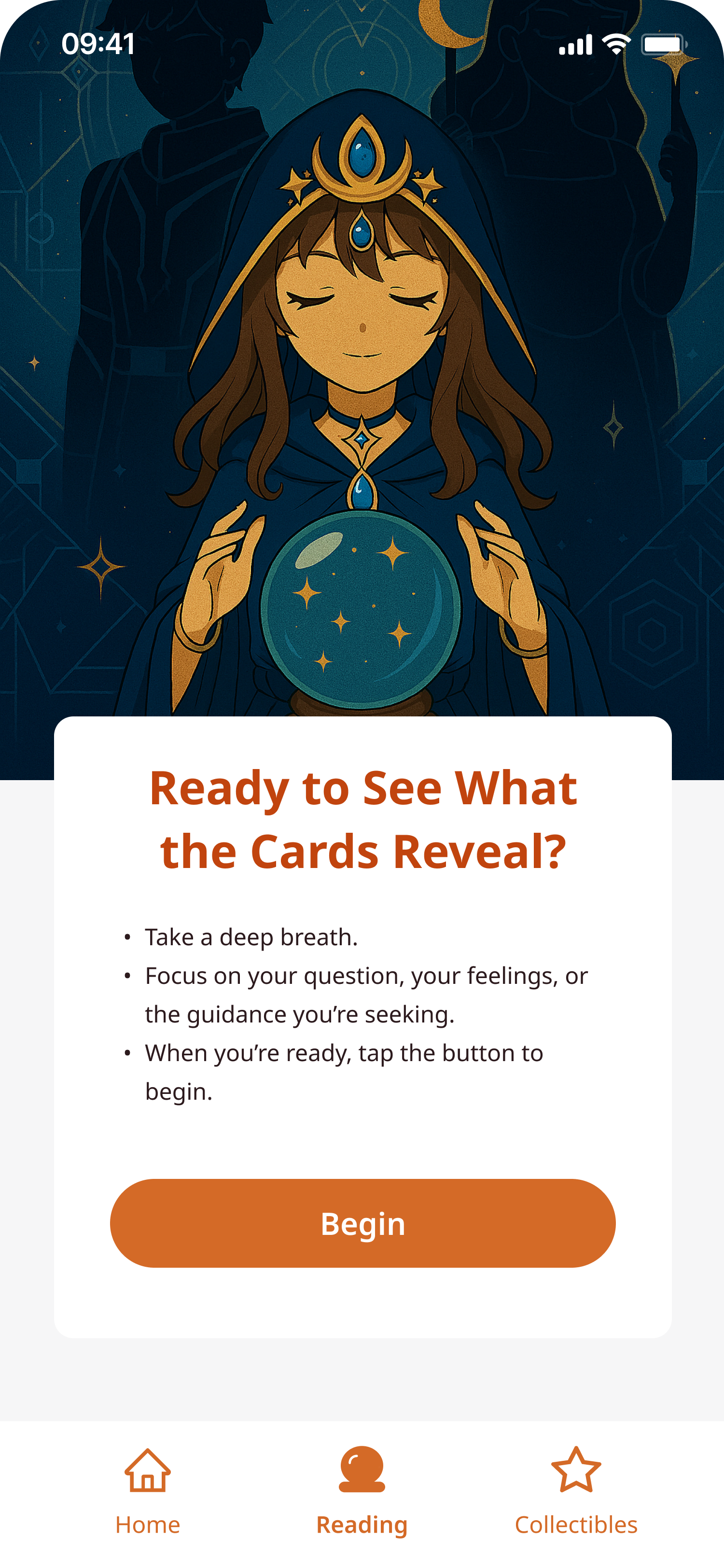
An Anime-Inspired Tarot App for Every Kind of Reader
Project Overview
A mobile tarot app for every kind of reader — built around a fully committed anime art direction that merges immersive visual storytelling, structured reading flows, and a collectibles system that rewards daily practice.
"How might we design a tarot app — for all experience levels — that feels like entering another world, while building a sustainable daily reading habit?"
The Problem
Most tarot apps are flat reference tools — pull a card, read a text block, close the app. No atmosphere, no habit loop, no reason to return. Visual design skews toward cold minimalism or dated clip-art, failing the digitally-native audience increasingly drawn to tarot.
No habit mechanics — no streaks, reminders, or progress rewards
Transactional sessions with no reflection or journaling layer
Card meanings as walls of text — no hierarchy or depth toggle
Cold, generic apps — no sense of world, character, or atmosphere
01 — Discovery & Research
Competitive Analysis
Six apps assessed. No competitor had invested in retention design — streaks, reminders, and rewards were absent or afterthoughts. Visual quality was consistently low.
User Interviews
Beginners feared 'getting it wrong' — wanted guidance, not condescension
Casual readers wanted a habit but found no app made it easy or motivating
All groups responded to character-based apps — a guide or companion resonated
Users don't just want to pull a card — they want a ritual companion. The app's character and world need to feel as considered as the tarot content itself.
02 — User Flows
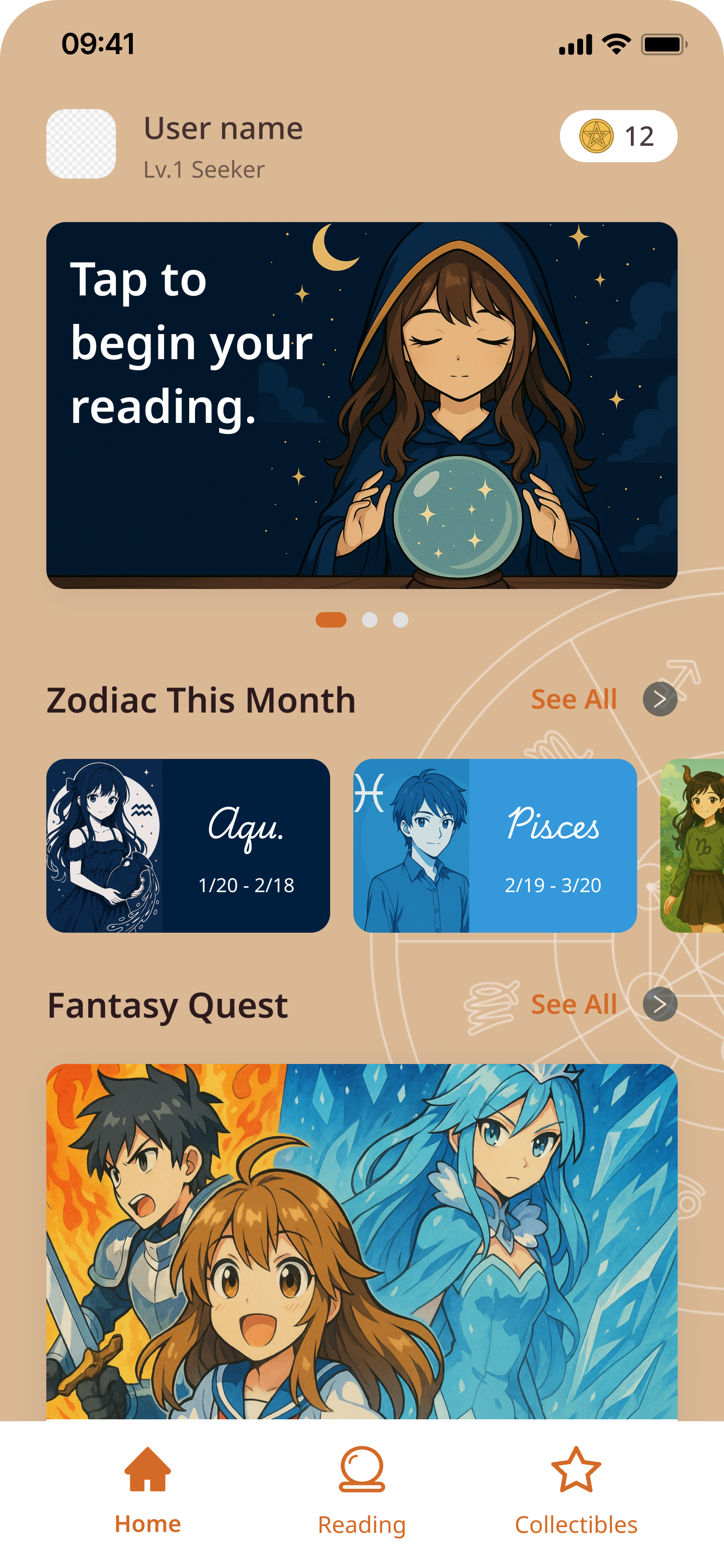
Home & Discovery
Daily draw CTA, Zodiac This Month, and Fantasy Quest — a gamified narrative layer rewarding consistent use.
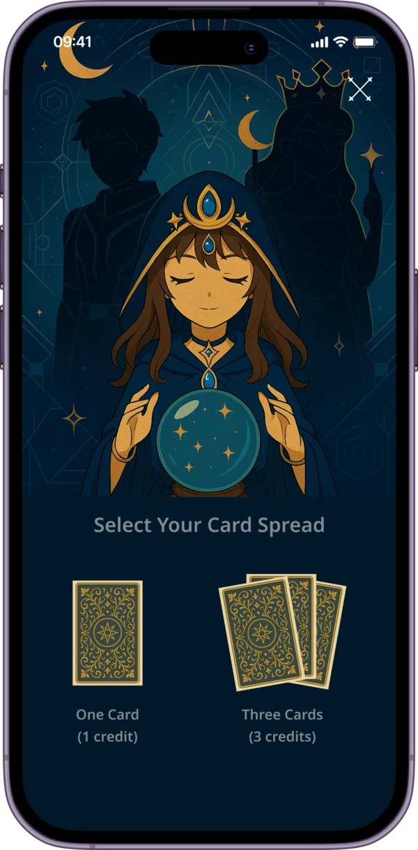
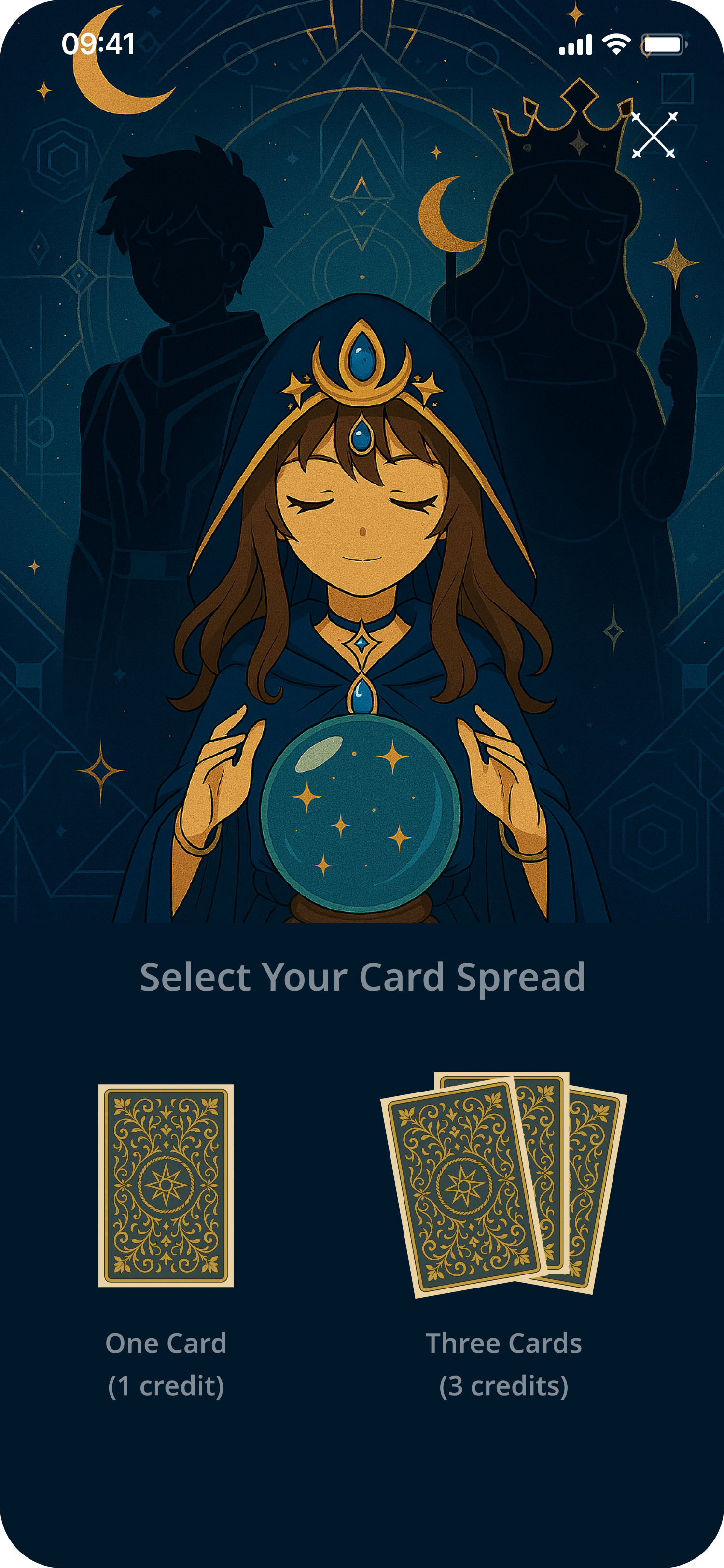
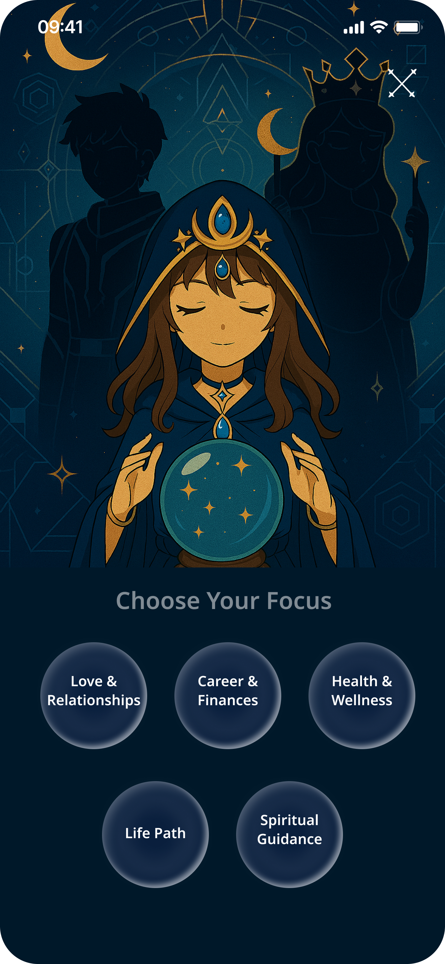
Reading Flow
Intention → spread → focus → 78-card arc draw → layered card reveal. Each step builds atmosphere and anticipation.
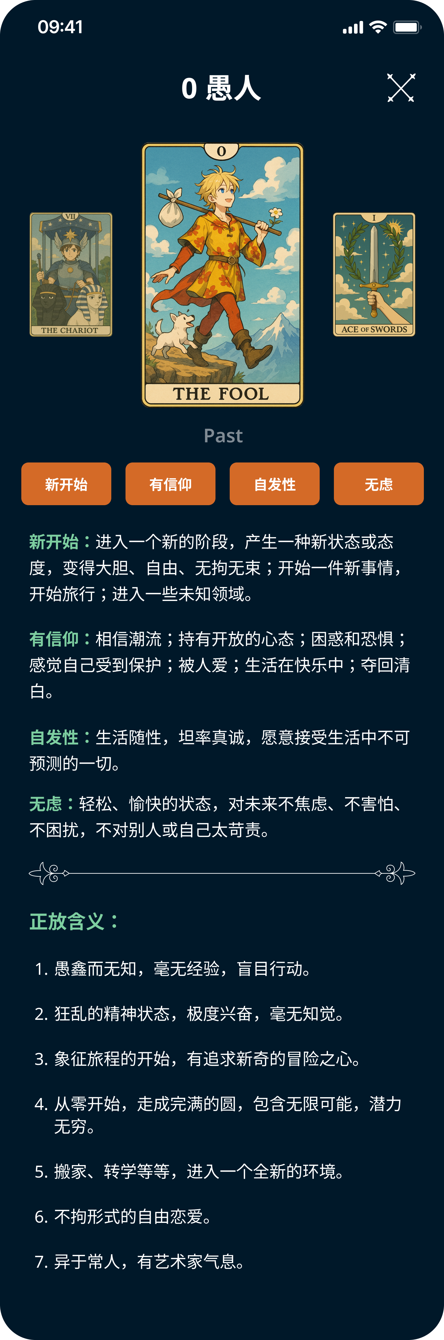
Card Detail
Keyword tags, layered meanings (positive / negative / reversed), consistent framing across all 78 cards.
Collectibles
Unlockable card collection rewarding daily draws and reading streaks — the habit loop's reward layer.
03 — Visual Design & UI
A single recurring oracle character guides every reading. Warm tan/cream for home & discovery; deep navy for reading screens — a deliberate palette shift that signals entry into the ritual space.
Home screen
Reading entry
Spread selection
Focus selection
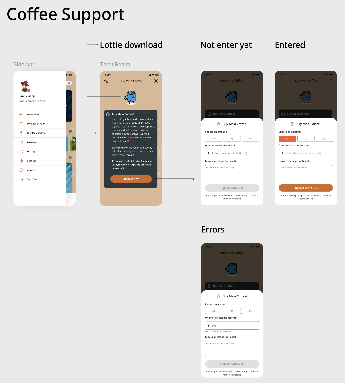
Coffee Support — Monetisation Feature
A "Buy Me a Coffee" integration surfaced through the app's sidebar — letting users support development with bonus in-app credits. Designed across three states: intro modal (with Lottie animation), amount selection, and validation errors.
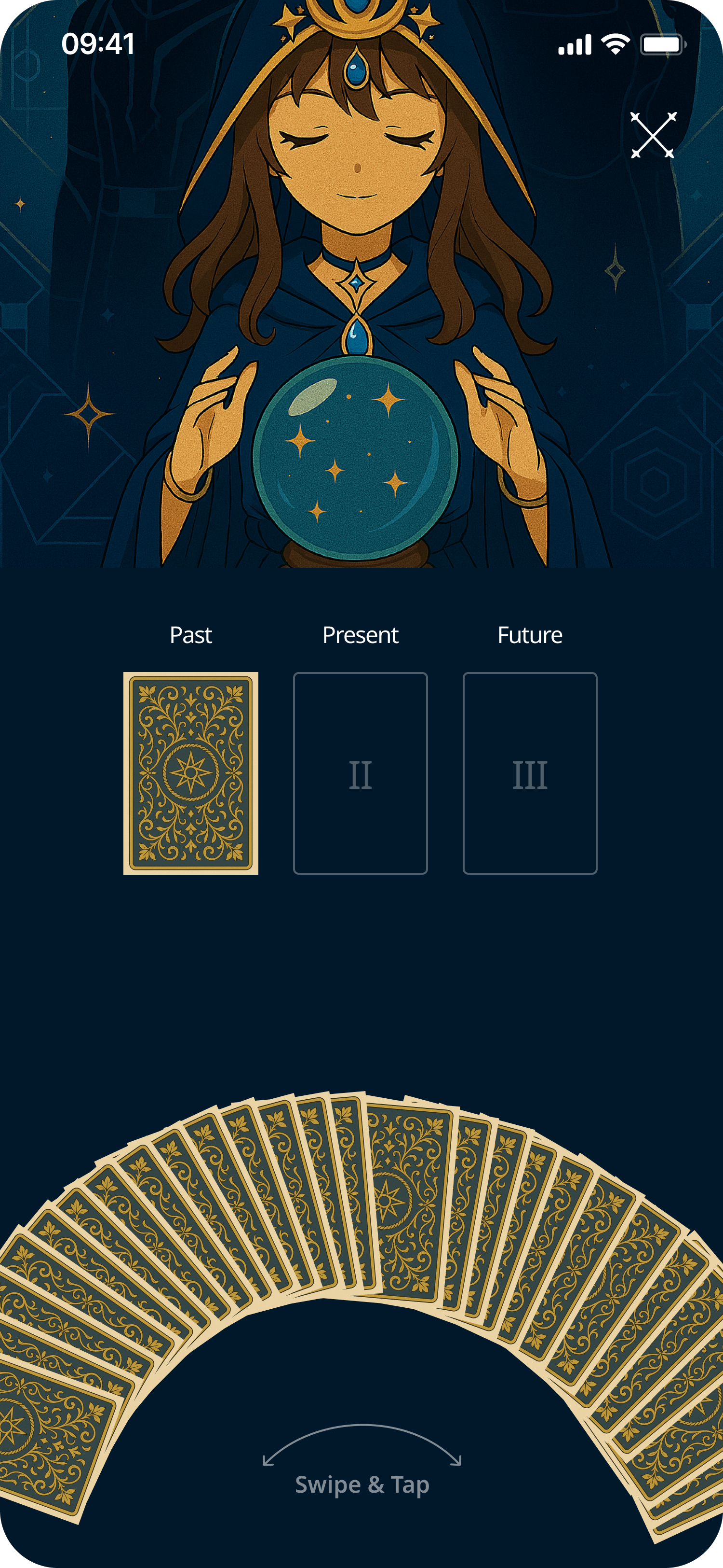
04 — The Card Draw Interaction
A fan of 78 card backs arcs across the screen. Swipe to browse, tap to select — physically fanning a real deck, translated to mobile. Unlike the standard 'tap one face-down card', the arc makes all 78 choices visible, reinforcing that the selection is real.
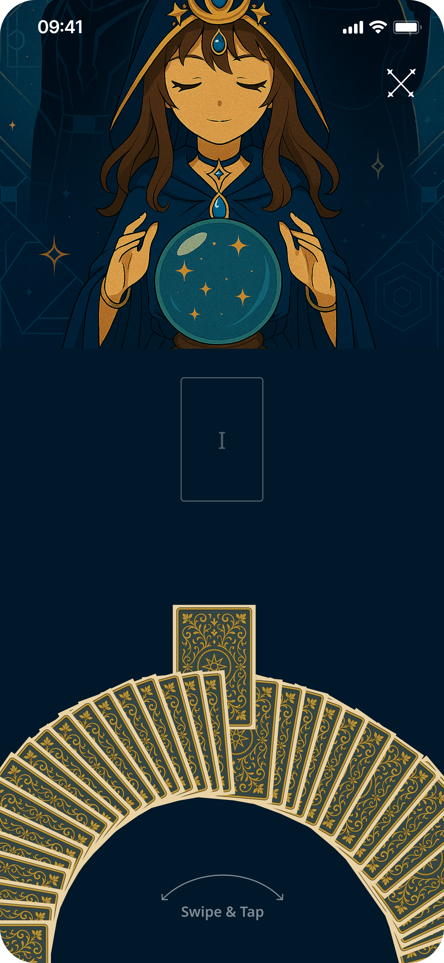
Pre-selection
Card placeholder visible above the arc, awaiting a draw
Post-selection
Chosen card rises from the arc into the reading position
05 — Card Detail & Reading Results
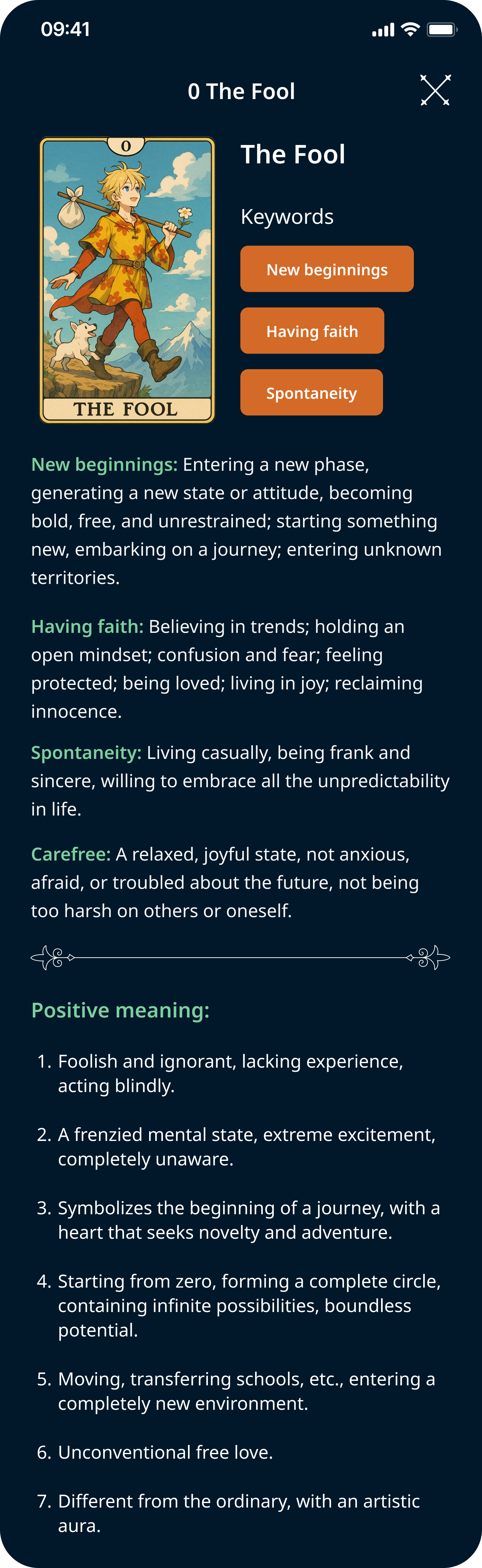
EN — keyword tags & meanings
ZH — localised card content
Amber keyword tags — fast, scannable signposting before body text
Short prose under each keyword — approachable for beginners, detailed for practitioners
Light background signals 'reading mode' and reduces fatigue during longer sessions
Fully localised — card names, keywords, and meanings available in English and Chinese
06 — Three-Card Reading Flow
Three sequential draws, one position unlocked at a time. Results shown individually per card — not a three-up layout — so each card's meaning gets full attention.
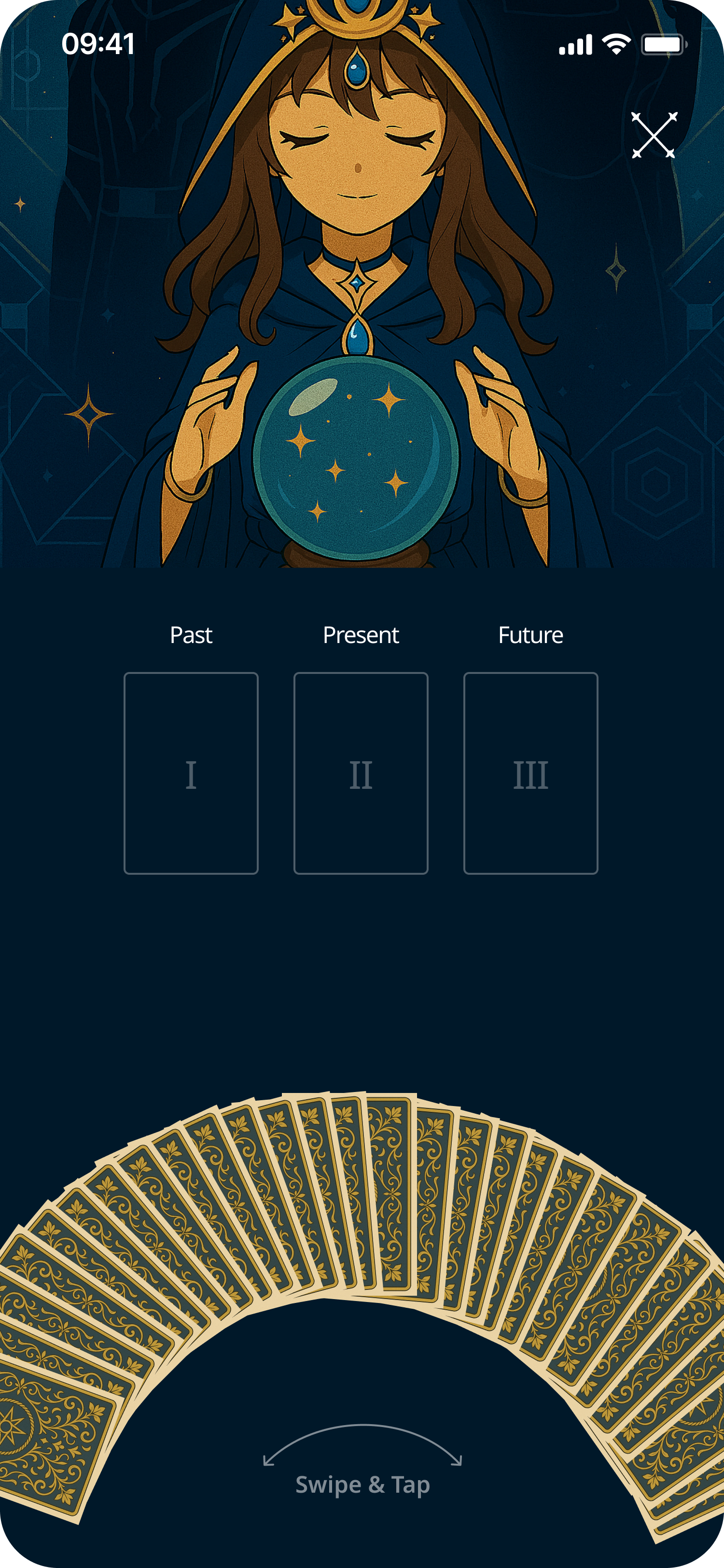
0 drawn
Past drawn
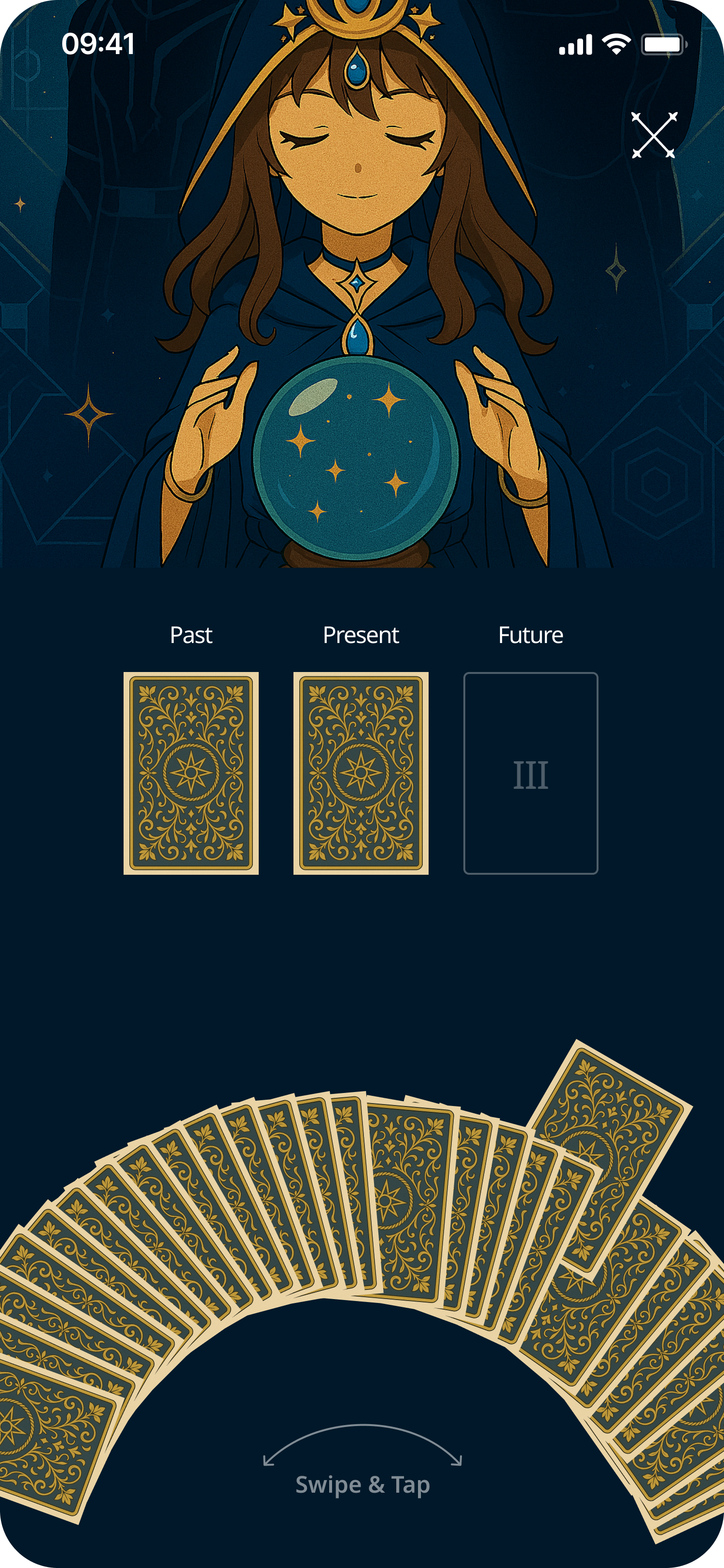
Past + Present
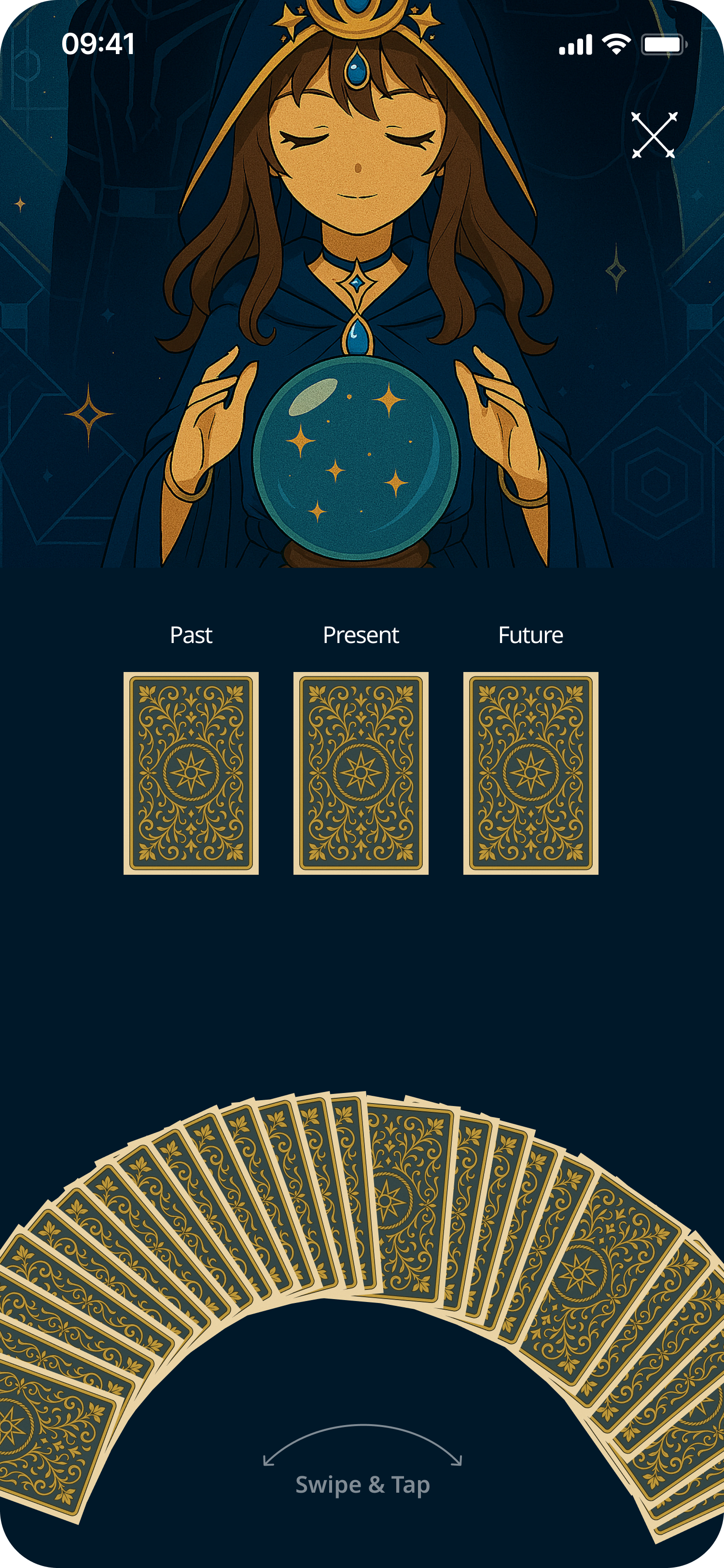
All 3 drawn
07 — Testing
Key Findings
5/6 completed the full flow without error on first attempt
Card arc was the standout moment — all 6 called it 'satisfying', 'tactile', 'like a real deck'
Oracle character felt like a trust signal — users felt 'guided', not alone with information
Iterations
Added 'Swipe & Tap' affordance label — first-time users were unsure of the gesture
Increased keyword tag spacing — users losing their place mid-scroll
Replaced spread selection text labels with card icon visuals
Outcomes & Reflection
The character, world, and visual consistency create a product genuinely distinct from every existing tarot app. The multi-step reading flow and collectibles system lay the groundwork for a habit product with real retention potential.
Proud of
Card draw arc — translating the physicality of real tarot into a gesture-first mobile mechanic
Dual palette theme — ritual transition without any user action required
Oracle character throughline across every reading screen
Next steps
Reading Log — saving past readings with date, focus, and notes (most requested in testing)
Deeper Collectibles — new card back designs or oracle outfits as practice rewards
Onboarding path — first-run reading calibrated to self-reported experience level
✦ Product Design Case Study
Enhancing Card Value Experience for International Students
Overview
Velo by East West Bank had no debit card rewards experience. I led the design of a new Debit Card Perks program — giving international students and debit card customers a way to discover offers, earn cash back, and track rewards directly inside MB and OLB.
01 — Context
Velo by East West Bank had no debit card rewards experience. Debit card holders — especially the international student segment — had no native way to discover merchant offers, earn cash back, or track rewards inside the banking app. A competitor audit confirmed this was a gap the market had already solved; East West Bank hadn't. The ask was to design it from zero.
Current situation
Customers who wanted debit rewards had to leave the app entirely and find offers through third-party services. No cash-back tracking, no map of nearby deals, no reason to stay engaged between transactions.
Ecosystem
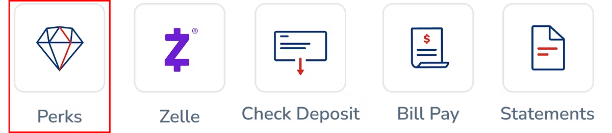
The program needed to live in both Mobile Banking and Online Banking with consistent capability. Entry on mobile via a Perks diamond quicklink. Student Perks ran as a subset of the same offer engine, tailored for enrolled students.
Awareness (Perks quicklink on home) → discovery (category browse or map view) → merchant detail (offer terms and activation) → cash-back summary (pending vs. settled, lifetime totals). The highest-friction point was discoverability — users didn't know the feature existed until we surfaced it as a primary entry point.
02 — Problem-Solving
Competitive analysis covered U.S. and international markets — Wells Fargo, Chime, and Rakuten for the domestic frame; JD.com, Meituan, Dianping, and Ctrip for the super-app paradigms familiar to East West Bank's bilingual international student base. Target users: NRA students and SSN/NRA debit card customers — price-sensitive, bilingual, actively seeking deals. Internal data confirmed this segment was the highest-churn risk with the lowest in-app engagement.
Painpoints
No offer discovery layer. Customers had no native way to find merchant offers. Without a browsing surface — category-indexed, searchable, map-enabled — there was nothing to engage with. Offers that existed through partner programs were invisible inside the product.
No cash-back visibility. Pending cash-back, settled amounts, and lifetime totals existed at the program level but were completely absent from the customer-facing product. Users had no feedback loop to confirm their card was working for them.
No geographic context. Debit card spending is local. Without geo-targeted discovery, the offers list felt abstract — a grid of merchants with no relevance to where the customer actually was.
Solutions
Solution 1
Eight categories — Grocery, Gas & Auto, Restaurants, Shopping, Travel, Health & Beauty, Home Goods, Entertainment — with icon-led navigation drawn from JD.com and Meituan, adapted for banking. Search indexed across merchant name, category, and descriptive keywords.
Solution 2
A dedicated summary view surfacing current balance, pending rewards, and lifetime totals. Pending vs. settled framing drawn from Chime and Rakuten — clear enough that customers understood when cash-back would settle without contacting support.
Solution 3
Location permission requested with a trust-first design — explaining value before requesting access. Offers surfaced as pins within a configurable radius, making Perks contextually relevant at the moment of spending.
03 — Process
A cross-functional kickoff with PM, engineering, QA, compliance, and the East West Bank digital banking team set the early questions: What categories matter most to this user segment? How do we surface the entry point without disrupting the home screen hierarchy? How does Student Perks inherit from Debit Card Perks without requiring a separate design system?
Offer discovery via category browse · Offer discovery via map · Cash-back summary and history · Offer activation and detail. Entry point unified through the Perks diamond quicklink, with branching for enrolled students vs. standard debit holders.
Hi-Fi · Visual System
Type built on Nunito Sans for legibility across Latin and extended character sets. A bespoke category icon set and a colour system designed to hold a wide range of merchant brand colours without visual conflict.
Colour system
Category icon set
Quicklinks entry point
The Perks diamond quicklink (highlighted) is the primary entry point from the MB home screen.
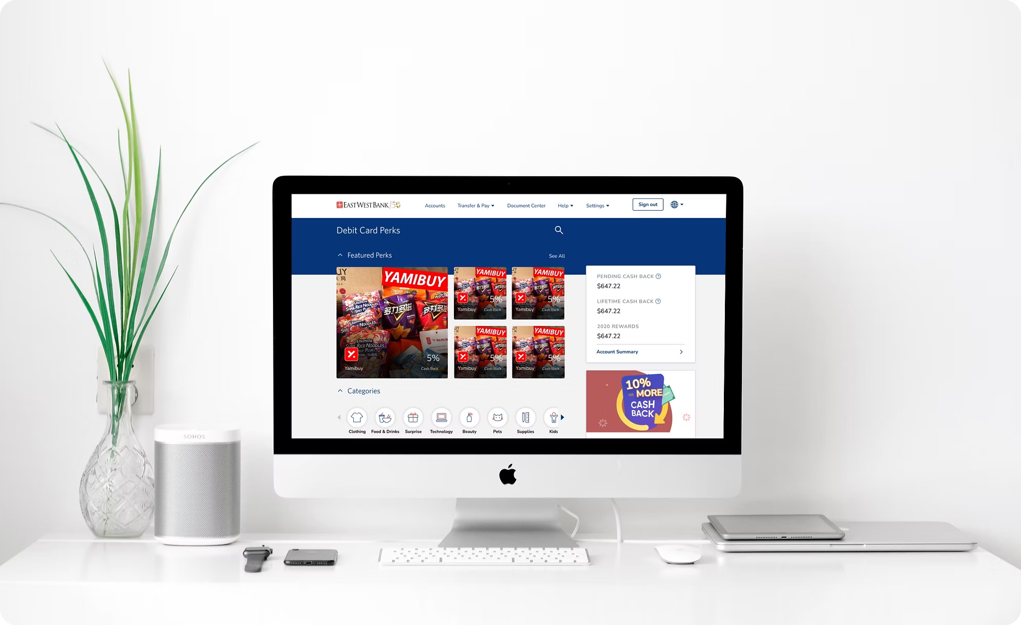
Hi-Fi · Mobile
Home screen entry point → My Perks (featured offers) → category browse → map with geo-targeted pins → offer detail → cash-back summary. Walking through each flow below.
Flow 01 — Landing
A single tap on the Perks diamond quicklink takes the customer from the MB home screen straight into the program. No menu drilling, no modal interstitial — discoverability was the biggest barrier in earlier rounds, so the entry point sits in the primary quicklink row alongside Zelle and Bill Pay.
Flow 02 — Offer Details
The offer detail page surfaces the cash-back rate, eligibility window, and merchant terms above the fold. Activation is a single CTA. Everything a customer needs to decide whether the offer is worth using lives on this one screen — no hidden fine print, no follow-up taps for the rate.
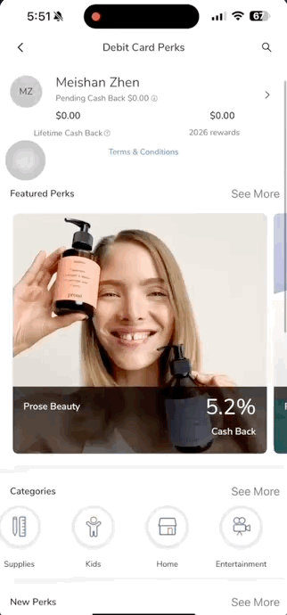
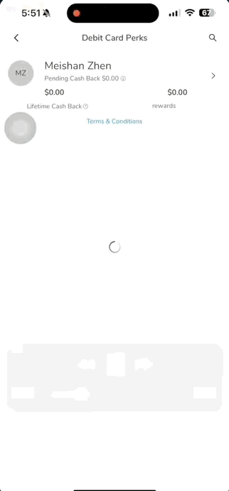
Flow 03 — Account Summary
A dedicated summary view that closes the feedback loop: how much has been earned, how much is still pending settlement, and a lifetime running total. The pending vs. settled split — borrowed from Chime and Rakuten — is the single change that reduced support tickets about "where's my cash back" the most in internal review.
Map integration & local offers
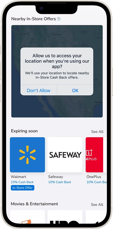
Location permission — trust-first design before requesting access
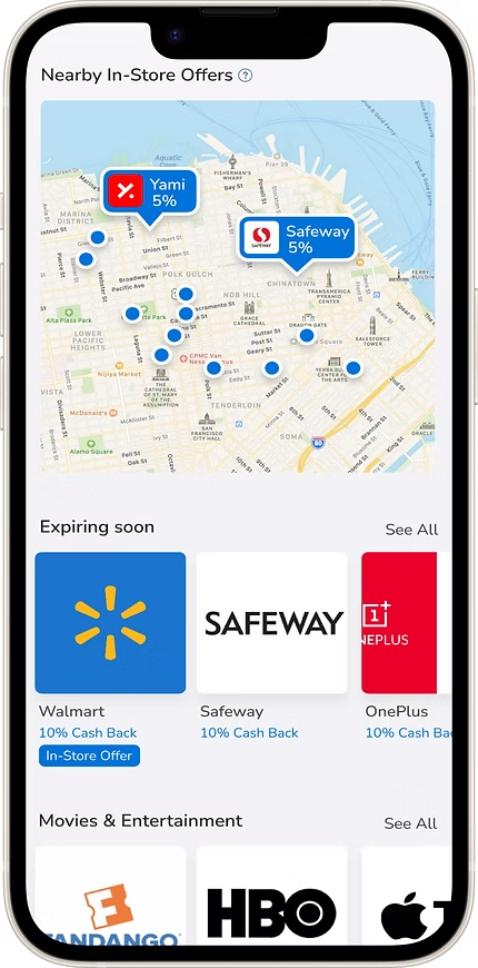
Geo-targeted pins — offers surfaced within a configurable radius
Hi-Fi · Online Banking
The desktop experience mirrors mobile — same offer detail pages, same cash-back flows, same enrolment path. Customers switching between mobile and web encounter no capability gap.
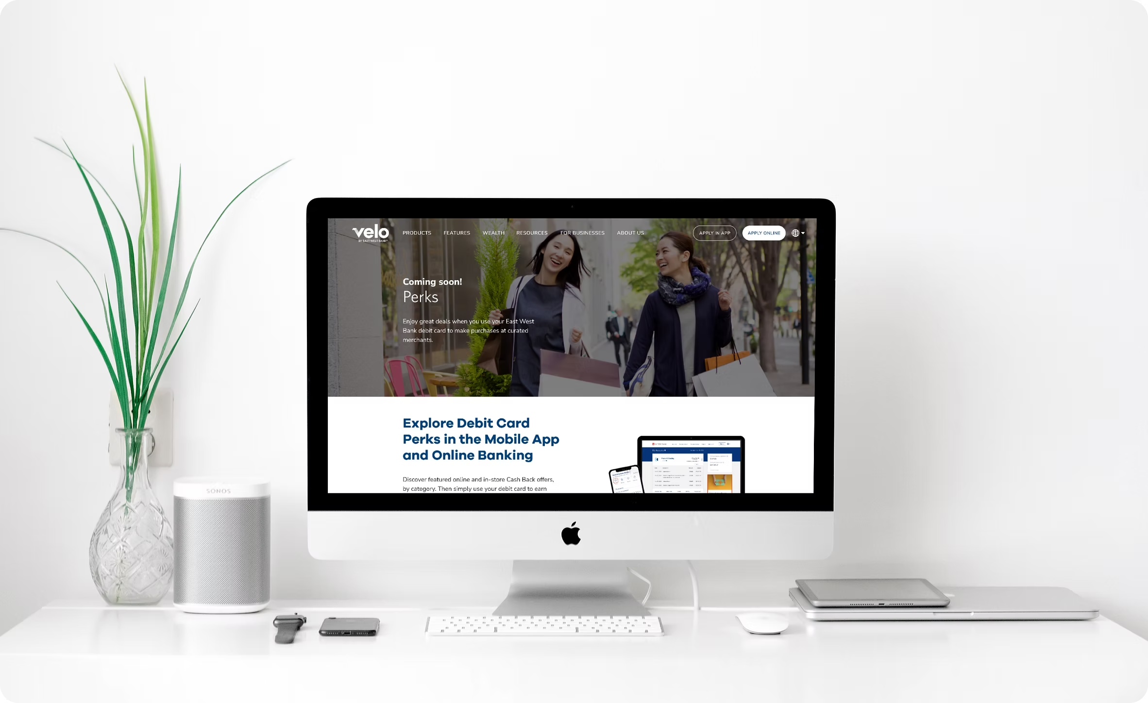
Design Detail · Marketing Page
A companion page outside the logged-in banking environment introducing Debit Card Perks to prospective customers — communicating value, surfacing key categories, and driving enrolment. Designed to work for both existing East West Bank customers and acquisition traffic.
04 — Impact
The Debit Card Perks program gave East West Bank a new lever for customer engagement — offering meaningful discounts to debit card holders across both mobile and web, while directly addressing an underserved, high-churn segment.
East West Bank customers with access
Merchant categories at launch
Platforms — MB & OLB
Student Perks, built on the same infrastructure, became a key selling point of the Student Product — reducing the differentiation gap against competitor student checking accounts. The program also established a geo-targeted offer layer as a first for East West Bank's digital banking product, and a reusable design pattern for future merchant partnership integrations.
05 — Takeaways
What I learned
Designing for a bilingual, price-sensitive segment sharpened my instinct for information hierarchy. Every label, every empty state, every cash-back summary had to communicate clearly on the first read — no idioms, no assumed familiarity with U.S. banking patterns.
The cross-market competitive analysis was one of the most valuable inputs — it prevented the team from optimising against a domestic baseline when the actual benchmark was significantly higher. Super-app users expect frictionless geo-discovery and real-time reward visibility as table stakes; most U.S. banking apps were nowhere close.
Working zero-to-one across PM, engineering, QA, and compliance reinforced how early decisions — like the category taxonomy and entry point hierarchy — compound downstream. Getting those right in the first week saved weeks later.
What I'd do differently
I'd push for moderated usability testing with actual students earlier — specifically on the offer detail page and cash-back summary. Both passed internal review but I believe there was room to reduce the cognitive load of the rewards breakdown for a first-time user.
I'd also advocate for a geo-permission A/B test: requesting access at first launch vs. deferring until the user explicitly navigates to the map. The deferred request likely converts better, and the data would have been worth having.
Finally, I'd build the category icon system as a shared component in the design system from day one — not as a project-specific set. The icons were extensible in theory, but adding a new category mid-project was slower than it should have been without a system-level owner.
✦
Velo by East West Bank · 2022
✦ UX Research Case Study
Optimizing the Velo banking experience for overseas customers
The Problem
Velo's product set lacked the depth to serve its non-resident alien (NRA) customer base — limiting growth and weakening the experience for overseas users with distinct financial behaviours.
The Solution
Expand offerings with additional NRA checking products and refine onboarding and money-movement flows — synthesised from moderated sessions with overseas customers across three distinct segments.
Target Audience
Interview questions covered basic context and pain points across onboarding, transfers, and service expectations. Findings were synthesised into personas for each segment.
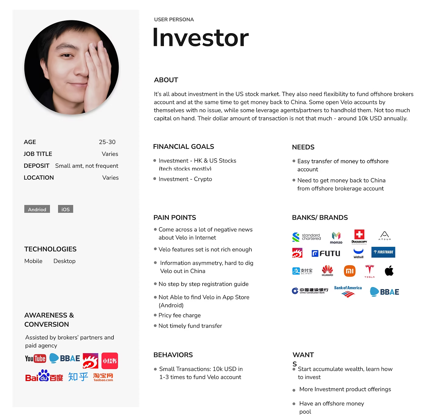
Investor
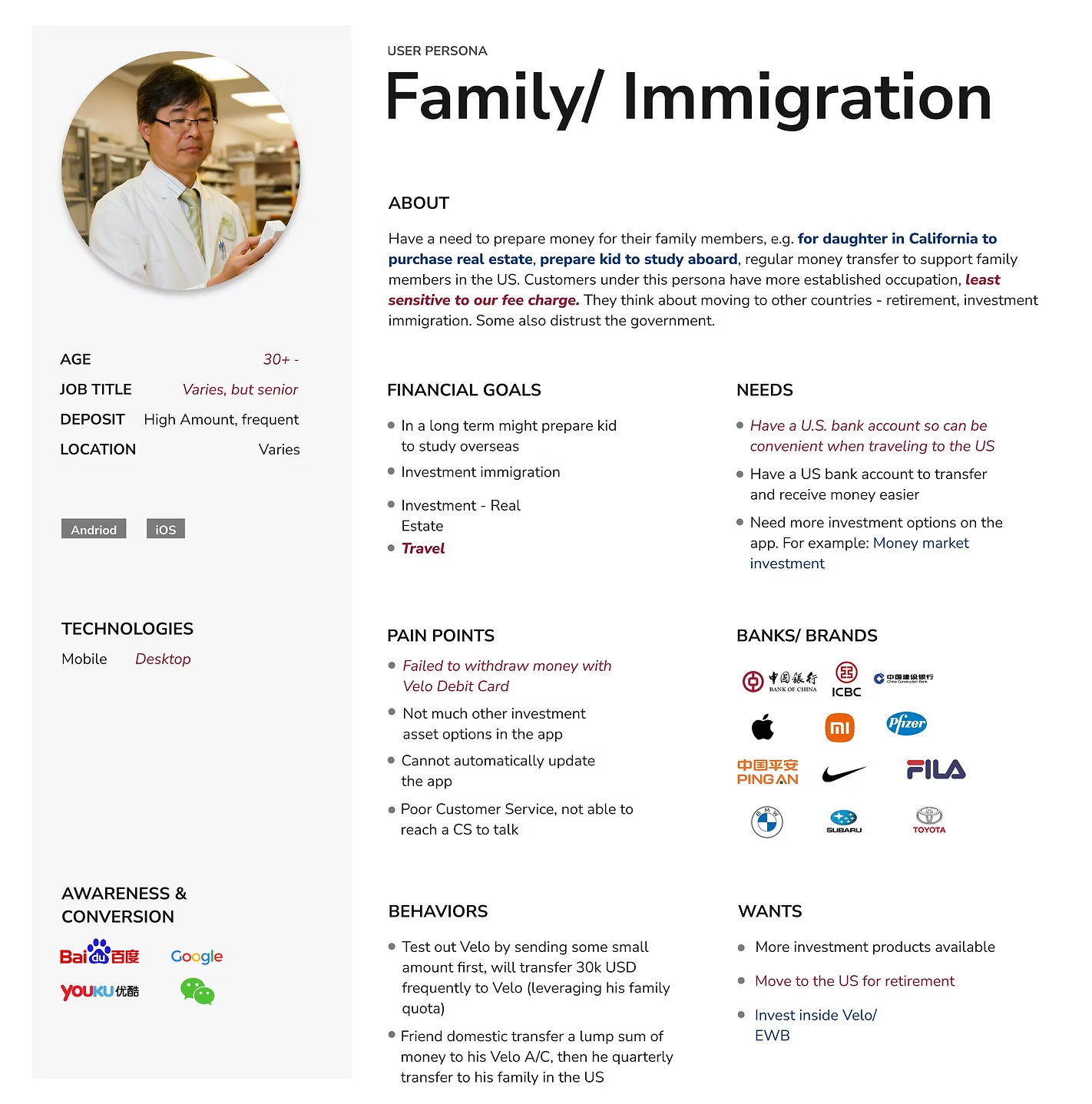
Family / Immigration
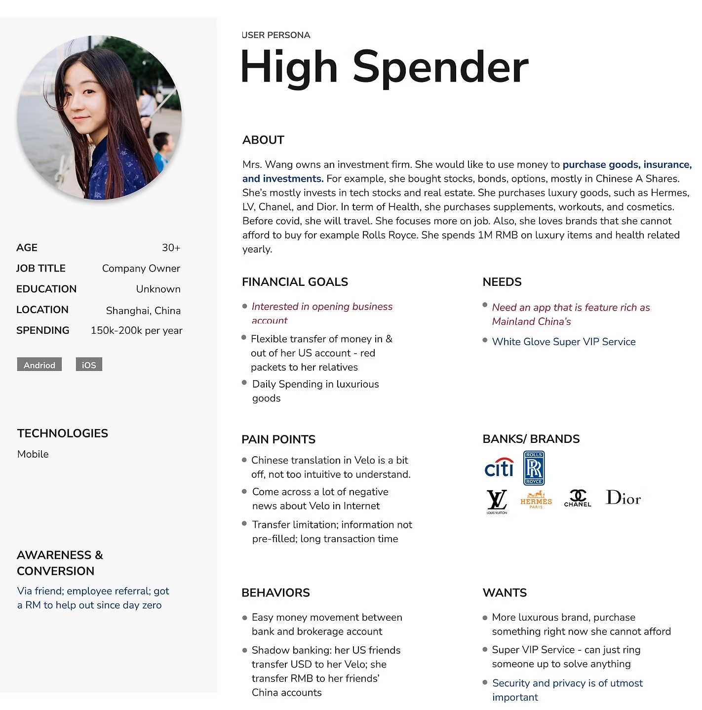
High Spender
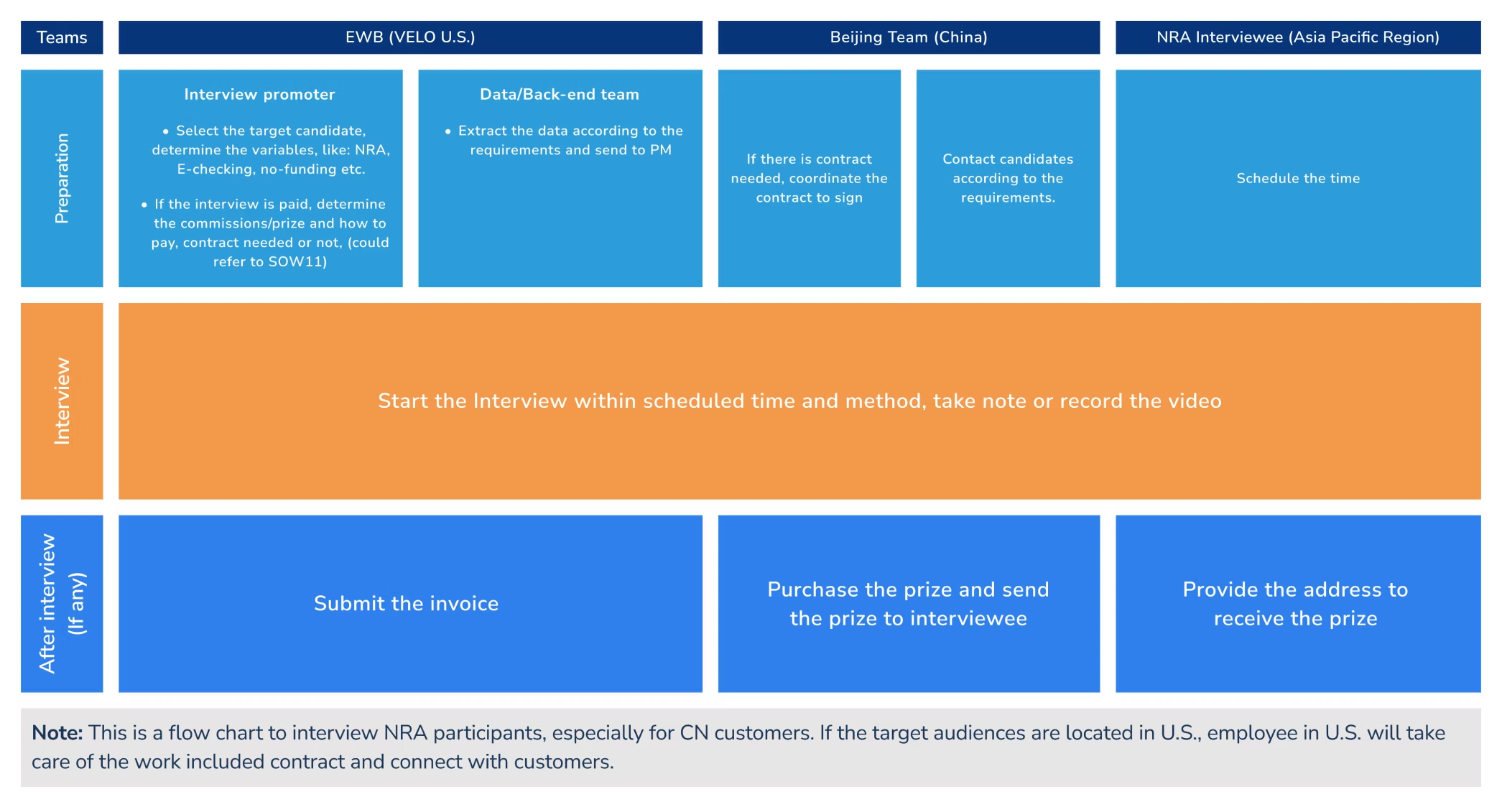
Research Process
Research spanned three time zones — the U.S. team, the Beijing product team, and APAC interviewees. This flowchart shows how preparation, interviews, and post-session logistics were divided.
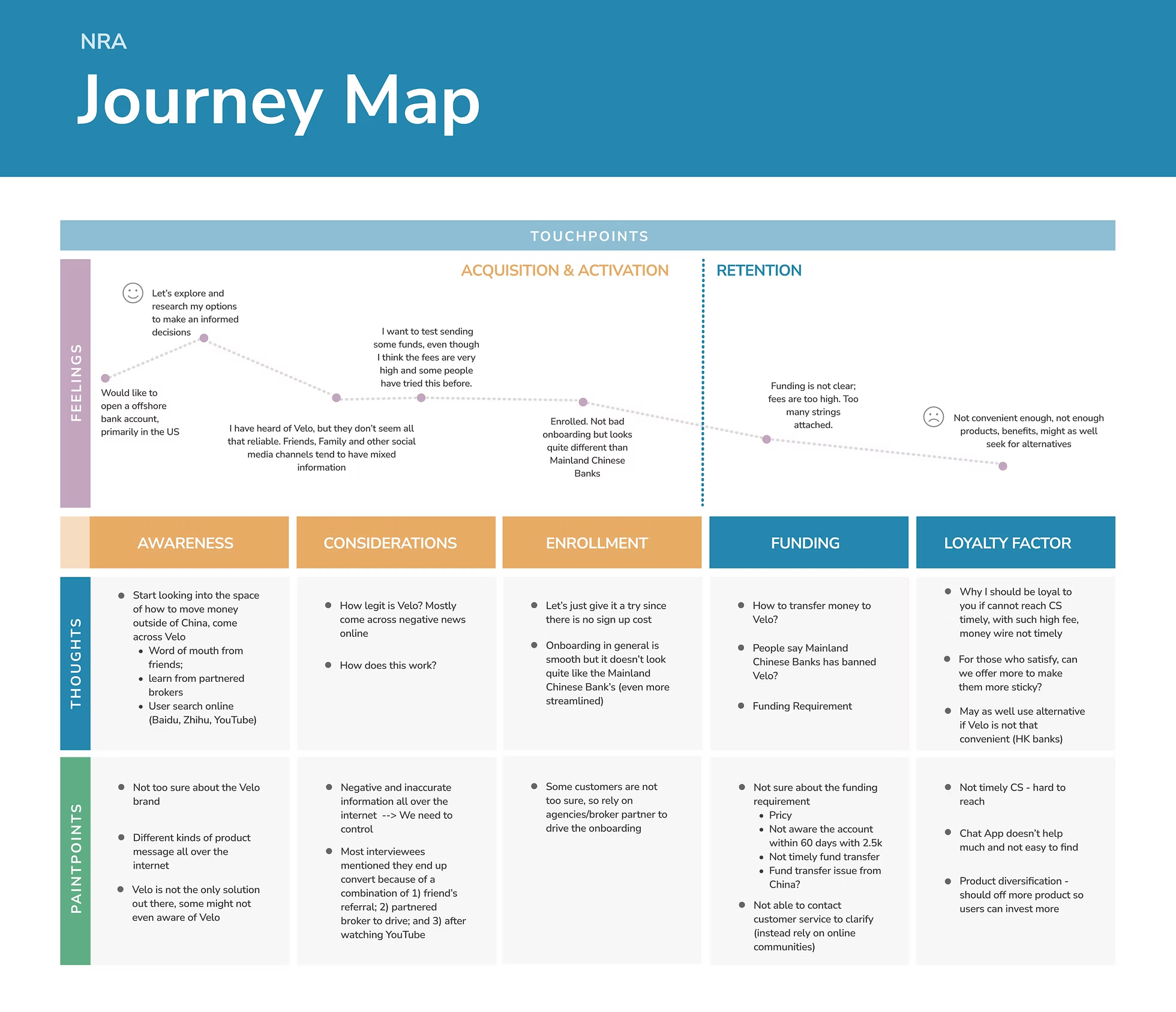
Journey Map
Five stages — Awareness, Considerations, Enrollment, Funding, Loyalty — capturing feelings, thoughts, and pain points. Drop-off risk was highest at Funding, where fee opacity and transfer complexity drove churn.
Top Insights
Competitive Context
NRA customers frequently held accounts at major Chinese state banks alongside Velo. Understanding their onboarding and transfer benchmarks set the bar Velo needed to meet — or exceed.
Design Response
Research findings drove two high-priority prototype updates: a progress-bar onboarding flow and a simplified domestic wire transfer experience.
01 — Onboarding: progress bar added
A progress bar introduced a clear sense of where users were in registration — addressing anxiety from an opaque ITIN and SSN process.
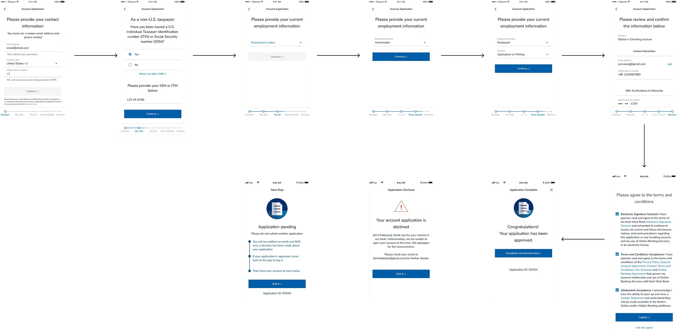
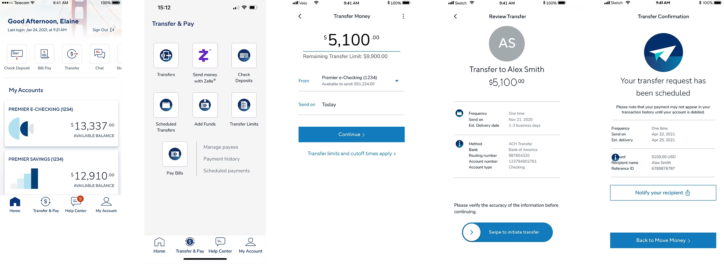
02 — Domestic wire: friction reduced
Key information — amount, method, fees, confirmation — surfaces progressively, reducing cognitive load and improving trust.
Before
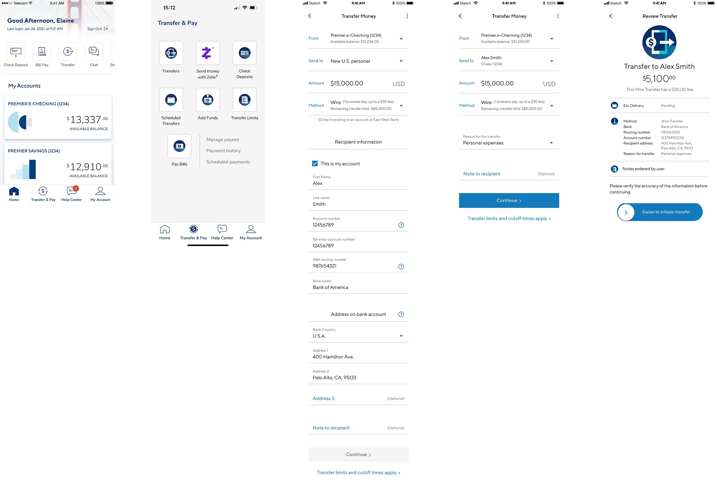
After
✦
By listening closely to overseas customers, the team turned qualitative insight into two shipped flows: a clearer onboarding experience and a less friction-heavy wire transfer journey.
✦ UX/UI · Creator Economy · Case Study
A messaging app that helps creators monetize follower outreach and support charitable causes
The Problem
Experts and creators receive far more DMs than they can handle, with no incentive to respond. Followers seeking advice rarely get a reply — leaving value on the table for everyone.
The Solution
A mobile app that lets creators set a price for responding, accept or reject requests, schedule paid meetings, and route a percentage of earnings to charity.
Product Walkthrough
Covers onboarding, the inbox, fee-setting, payment, the public Q&A library, and creator controls.
Research
Interviews across creators and nonprofit representatives. Creators consistently saw product-market fit; charities responded openly — "all money is good money."
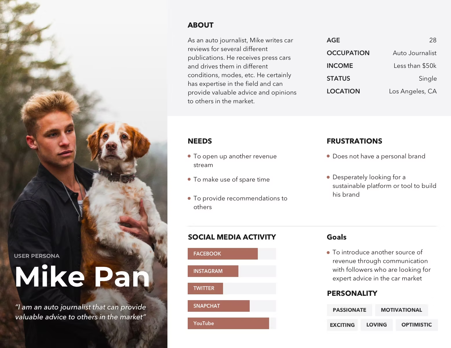
User Persona
Design Process
Aligned CEO, graphic design, and content strategy on goals and scope. Wireframes covered onboarding, conversations, payments, Q&A, and profile — refined before moving to high-fidelity.
User flowchart
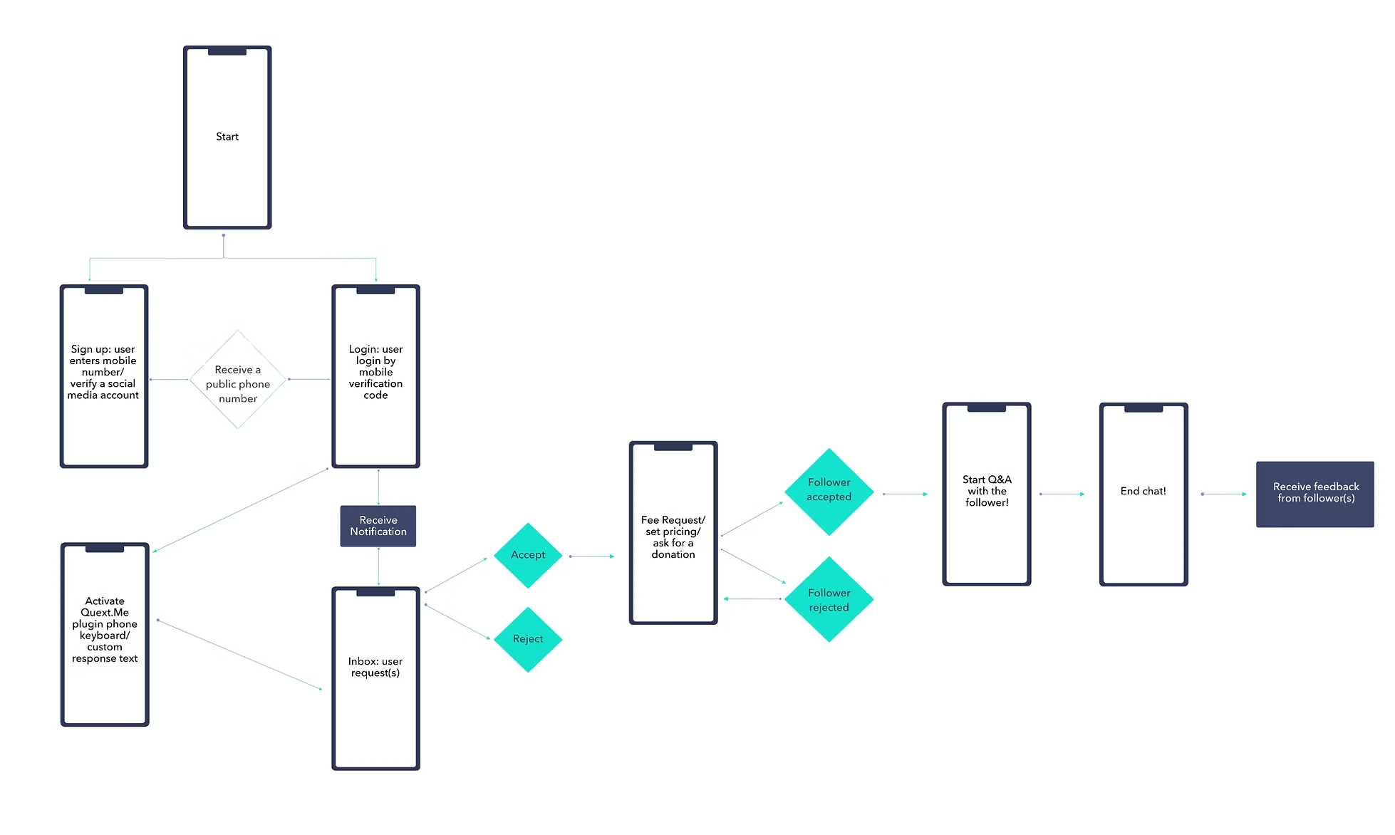
Key Features
High-Fidelity Prototypes
Full prototype coverage across onboarding, messaging and payment, and the broader feature set including Q&A, contacts, settings, and payments.
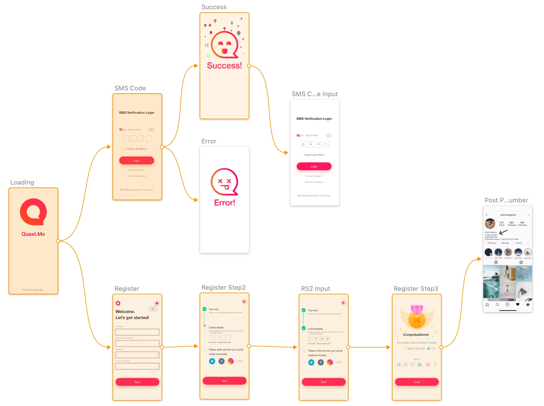
01 — Onboarding flow
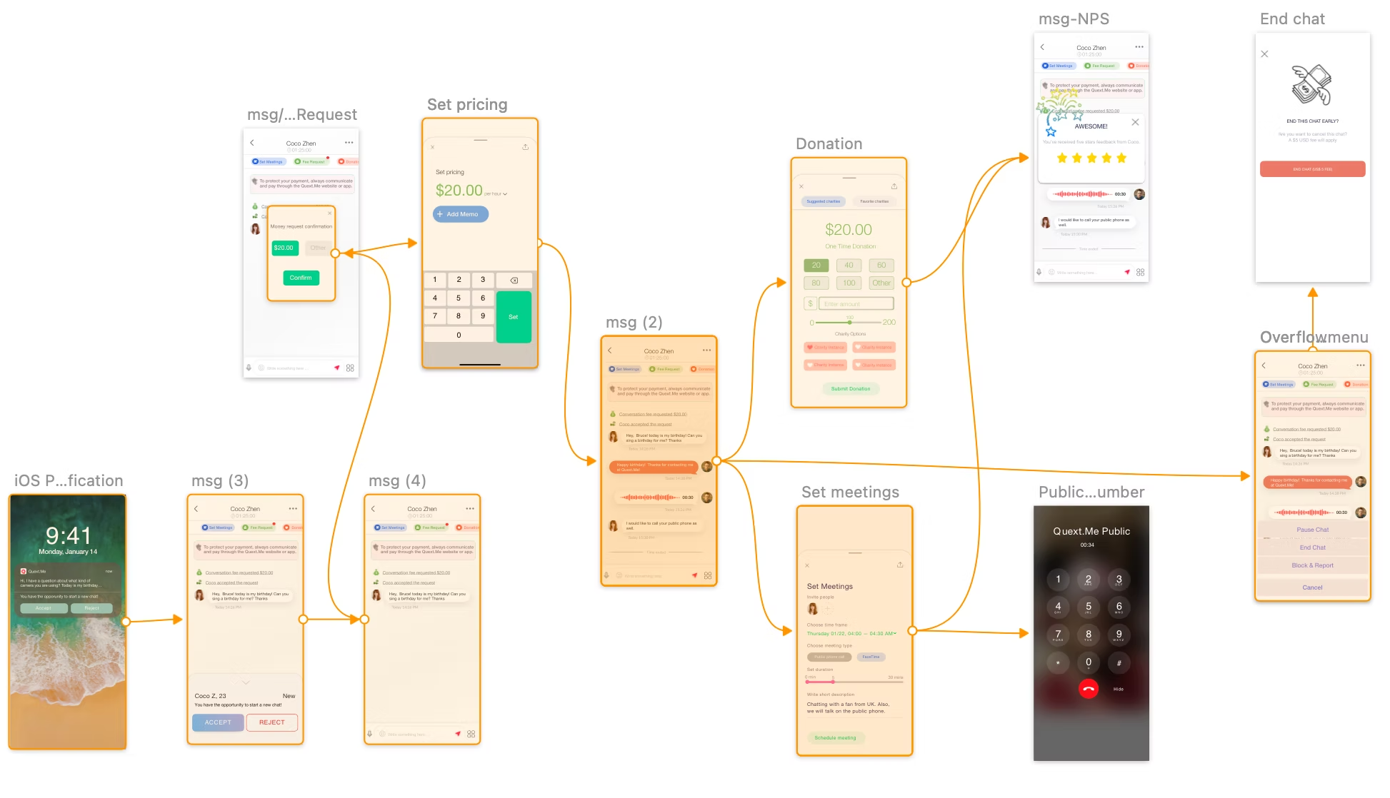
02 — Messaging, pricing & donations
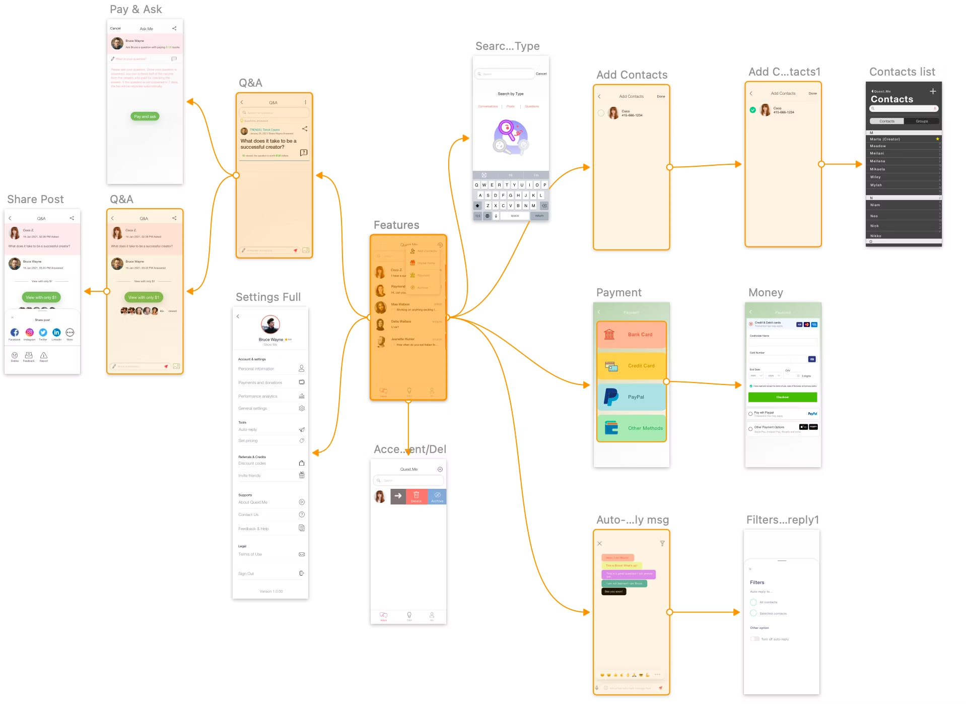
03 — Features, Q&A, contacts & payments
✦
Creators are compensated for their time. Followers get reliable access. Charities gain a new funding channel. Grounding the design in direct user interviews ensured the final product addressed real pain points across every group.
✦ Product Design Case Study
A new way for small businesses to manage cash, pay vendors, and track bills — built inside East West Bank's app.
01 — Context
East West Bank's app (Velo) had a growing base of small business customers. None of them had a built-in way to manage cash, pay vendors, or track bills. CashFlow Central — a Fiserv product — filled the gap. I designed the full customer experience from first marketing email to post-enrollment.
Many East West Bank customers are international business owners and first-generation entrepreneurs. Clarity and trust matter to them. Getting this right meant balancing Fiserv's technical limits with East West Bank's customer expectations.
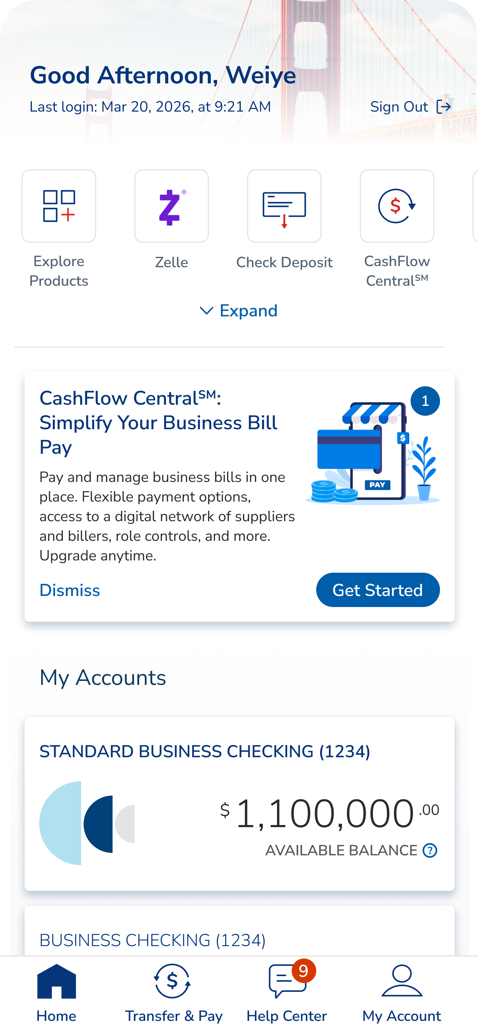
CFC sits inside the Transfer & Pay area and shows a promo card on the home dashboard. Users never leave the bank — CFC loads inside a secure frame using single sign-on.
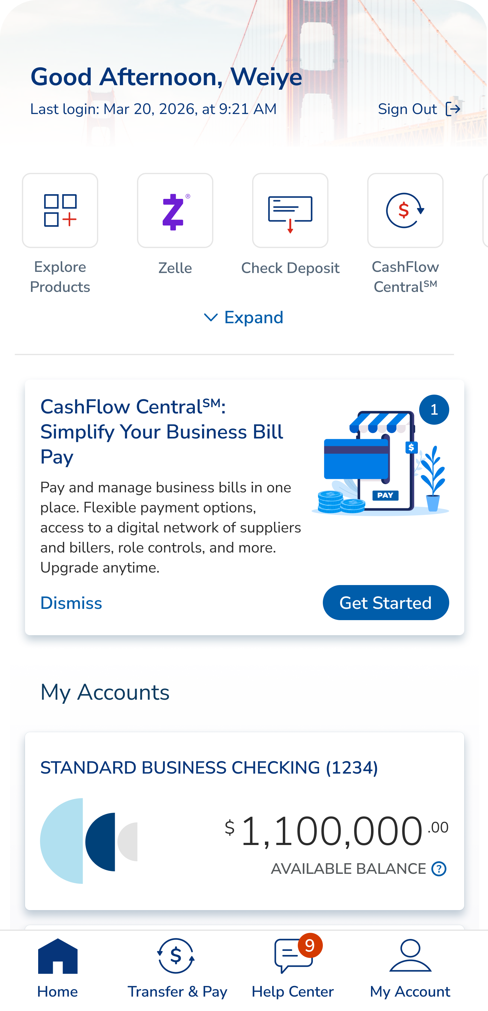
01 · Dashboard promo card

02 · Transfer & Pay entry tile
How do you add a powerful new product to a trusted banking app — without breaking that trust or overwhelming people at sign-up?
Ecosystem
CFC lives inside East West Bank's app but is built by Fiserv. That meant working within a tight set of rules.
Single sign-on. Users log in through East West Bank once. No second login.
Account changes happen on East West Bank's side. Adding or removing bank accounts runs through East West Bank's system, not Fiserv's.
East West Bank's own terms. East West Bank used its own Terms & Conditions instead of Fiserv's default — which meant extra compliance work.
Two bill-pay tools at once. Existing customers had to keep their old tool or switch — without confusion.
Business accounts first. The first account used to pay must be a business one. Personal accounts can come later.
User Journey Map
I mapped the full journey in two passes — a first version, then a refined one based on what we learned. Seven key moments.
Introduces CFC to current and new customers.
Gentle awareness — no interruptions to banking tasks.
Teaches first. No sign-up button until people understand what they're getting.
A nudge for people who didn't open the first email.
Users pick which business to enroll — one or many.
Brings back users who started but didn't finish.
Helps people get comfortable in the first 90 days.
02 — Problem-Solving
I looked at competitors, talked to internal teams, and reviewed how customers used the existing tool. Three user types stood out — and the design had to serve all three without becoming a mess.
Level 1 · Owner
The boss.
Makes the money decisions. Signs up the business, accepts the terms, approves staff. One per business.
Level 2 · Manager
The office manager.
Handles payments day to day. Can approve staff actions, set up autopay, and pay bills on their own.
Level 3 · Staff
The junior staffer.
Limited access. Small payments go through. Bigger ones need approval from the boss or office manager.
Many East West Bank customers compare their banking to apps like WeChat and Alipay. They expect things to feel effortless — a bar most U.S. banks don't meet.
Painpoints
New users hit the sign-up screen with no explanation of what CFC was or what it cost. Many dropped off right away. Hidden fees caused frustration later, after charges appeared.
People expected to sign up once and cover all their businesses. But sign-up worked per business. Without a clear pick-your-business step, many enrolled only one and called support.
Staff who tried to use CFC before their boss approved them saw nothing — no message, no next step. They kept trying to log in, then called support.
Solutions
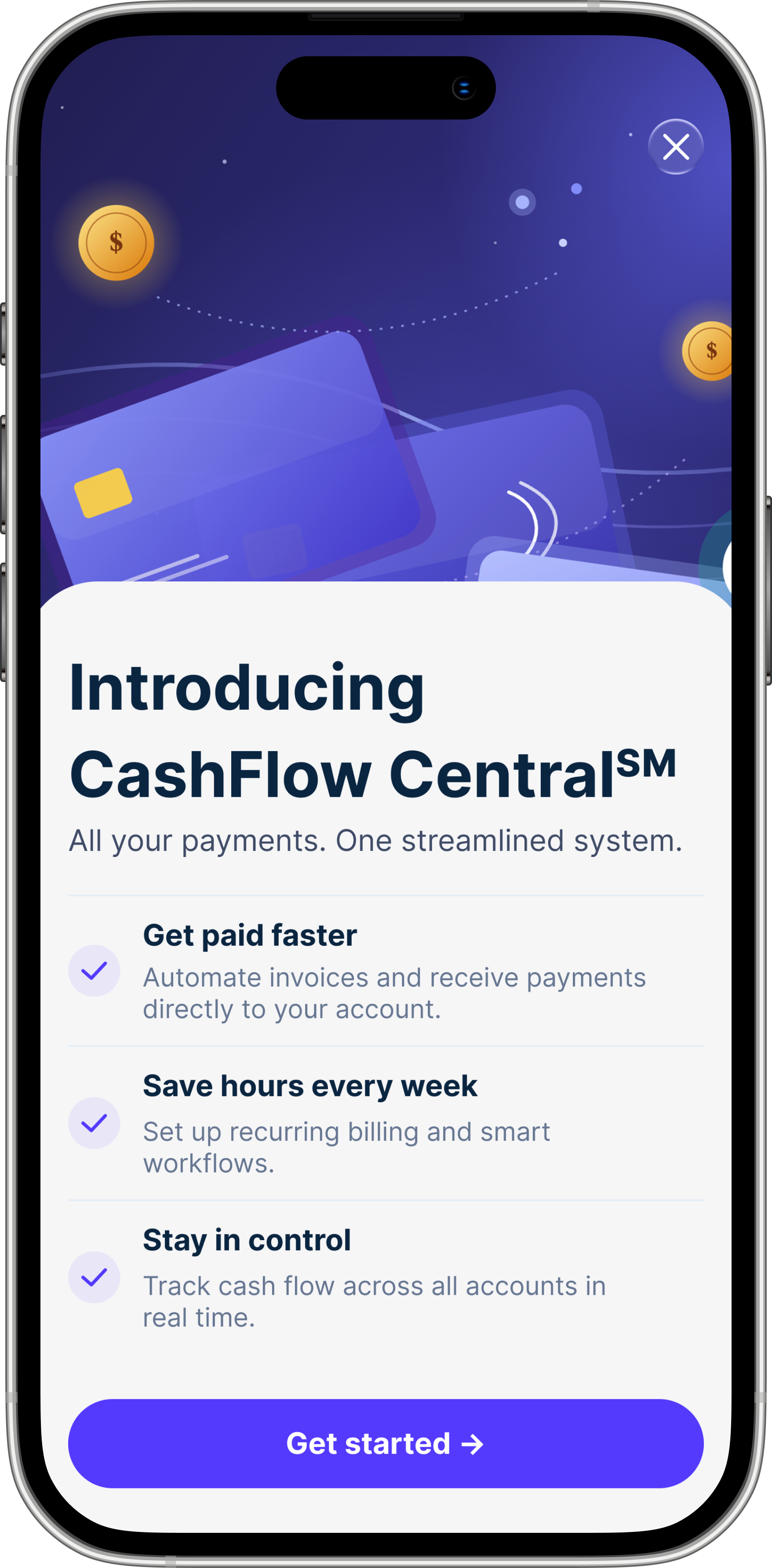
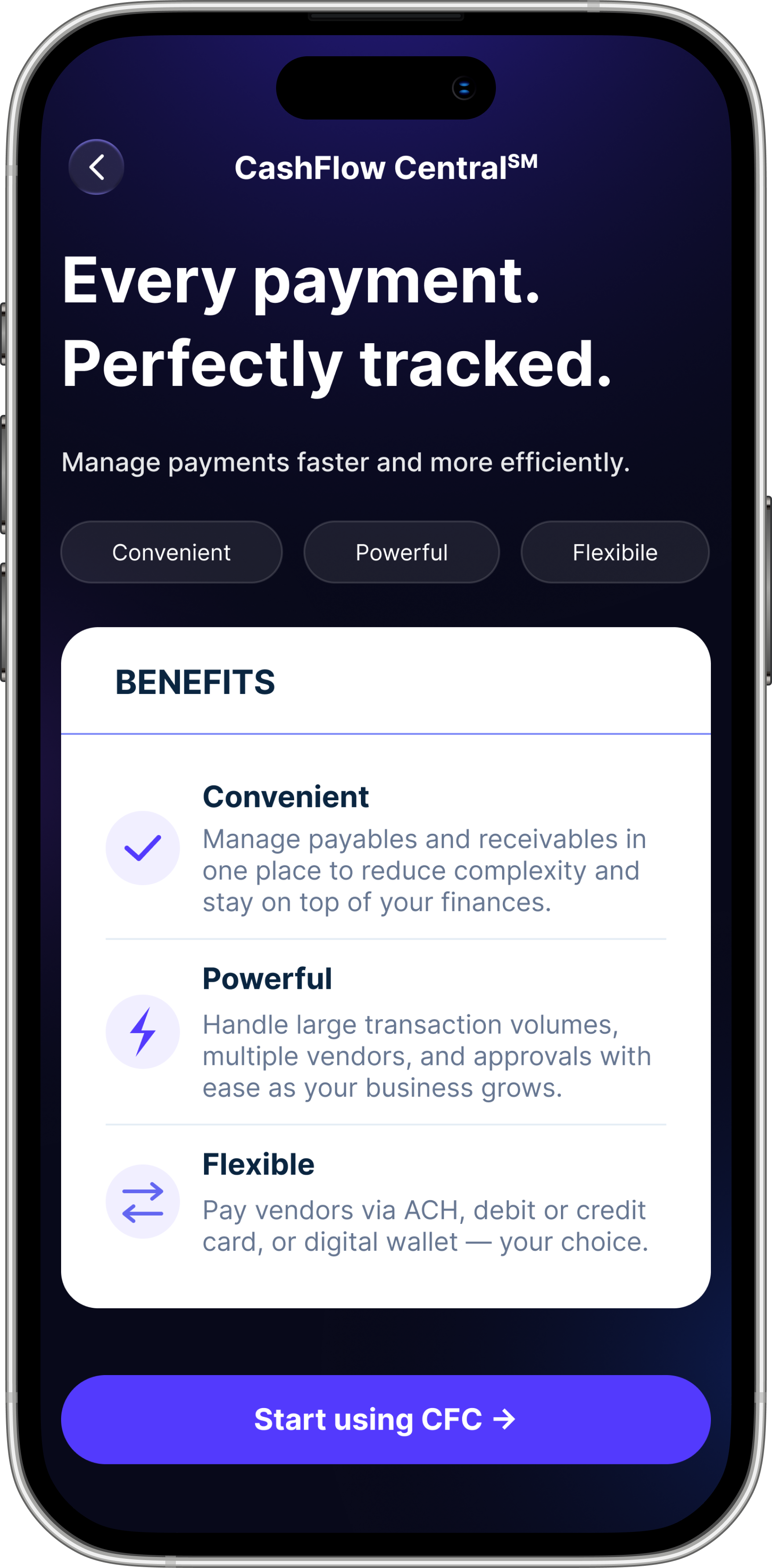
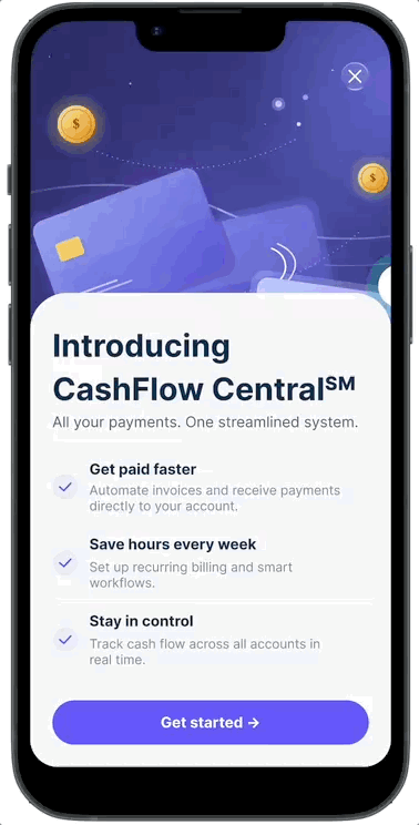
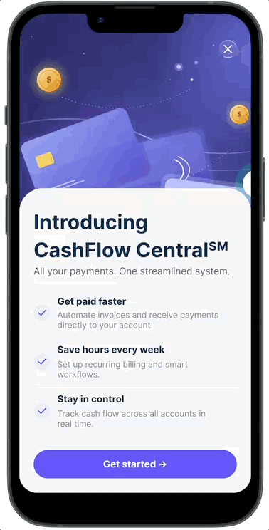
Solution 01
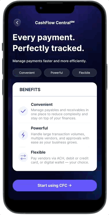
Added a landing page — "Every payment. Perfectly tracked." — that everyone sees before sign-up. It covers three benefits (Convenient, Powerful, Flexible), shows fees clearly, and ends with one simple call to action.
Prototype: landing screen with benefit cards, fee callout, and button states.
Solution 02
A new screen shows all the user's businesses before sign-up — built on a pattern they already know from Zelle. The button changes from "Enroll →" to "Continue →" for businesses already signed up, so no one signs up twice by mistake.
Prototype: covers one business, many businesses, already-enrolled, and not-eligible.
Solution 03
Staff waiting for approval now see "Contact Your Administrator" — a friendly warning icon, plain words, and one clear button to go back. No dead ends, no jargon.
Prototype: the full staff path from waiting → approved → access granted.
03 — Process
We kicked off with PM, engineering, QA, compliance, and Fiserv. Early talks focused on the branching logic — user type, number of businesses, sign-up status, and error states.
An early idea — one flow for everyone — fell apart fast. Bosses and staff needed very different paths. So we built two.
A visual map of every yes/no point in the journey — One business or many? Boss or staff? Have the terms been signed? Are the accounts eligible? — became the single source of truth for design and engineering.
Built in Figma for iOS and desktop. Every screen, every error, every loading state. Here are the four main ones.
Dashboard · CFC promo on home
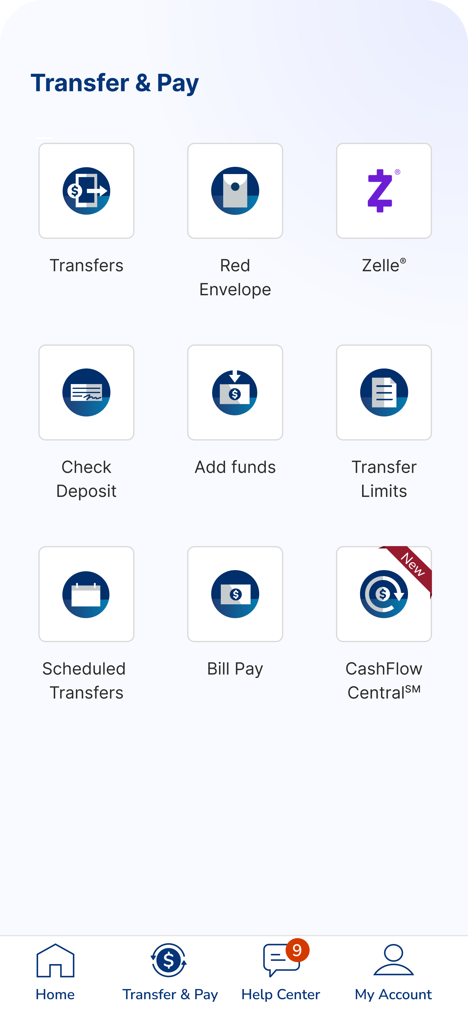
Entry · Transfer & Pay tile
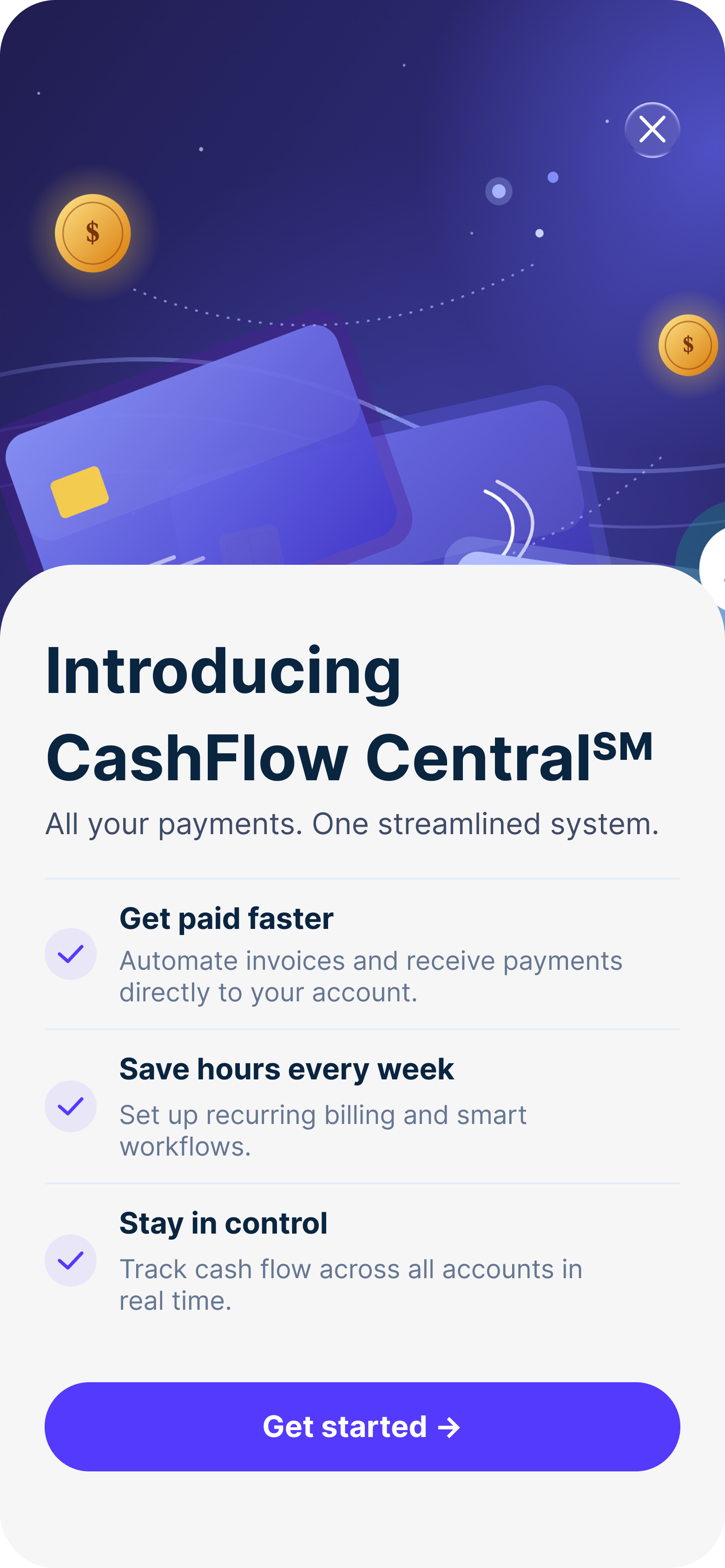
Splash · Introducing CFC
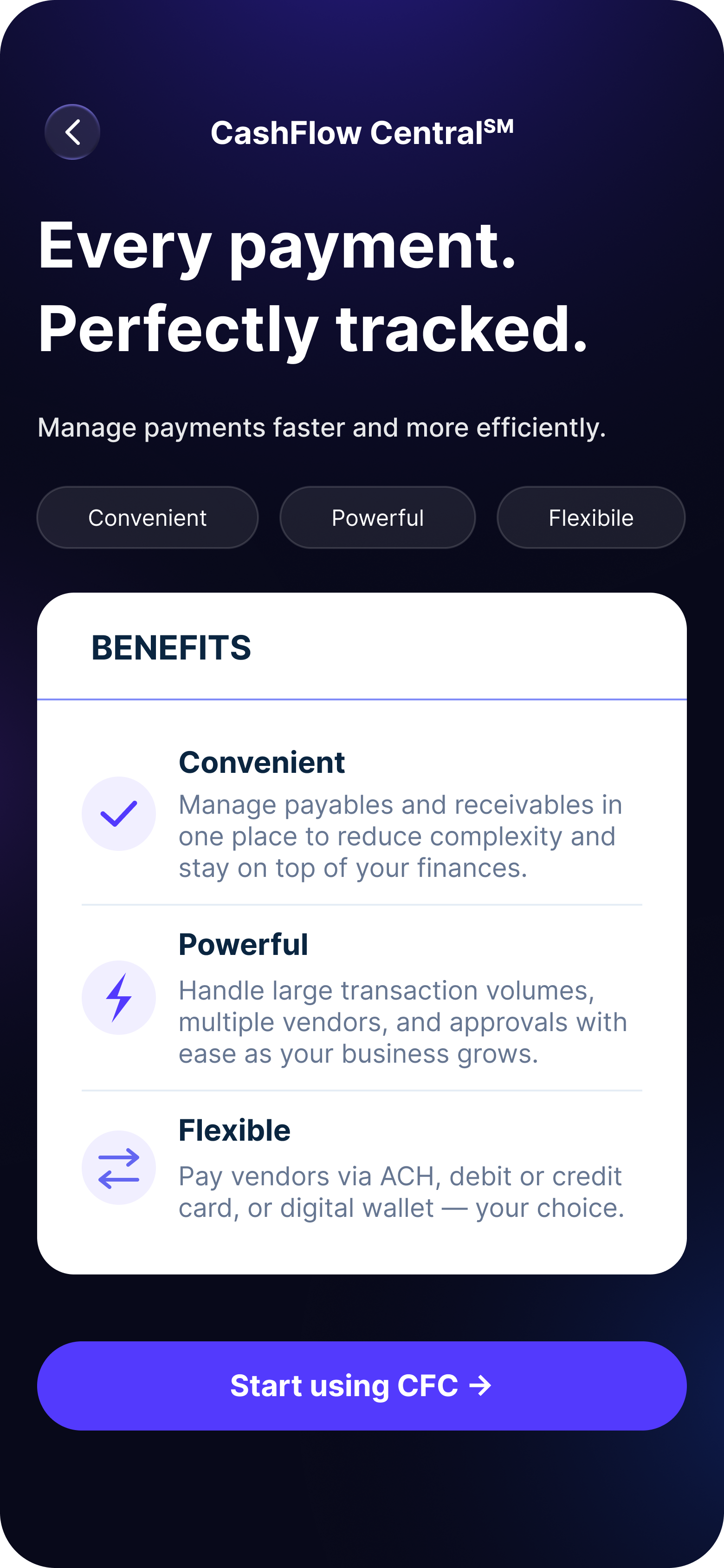
Benefits · Every payment, perfectly tracked
Smart button label
Enroll → Continue. A tiny change that stopped people from signing up twice for the same business.
Equal-weight terms buttons
"Yes, I agree" and "No, I do not agree" look the same. No dark patterns. Compliance signed off.
Fees shown up front
The landing page shows fees before sign-up. No surprises later.
Easy to translate
Short sentences. No idioms. Ready for East West Bank's Mandarin-speaking customers.
Error State Design
Three error screens needed careful wording — calm, not alarming, with a clear next step. A fourth handles staff waiting for the boss to sign the terms.
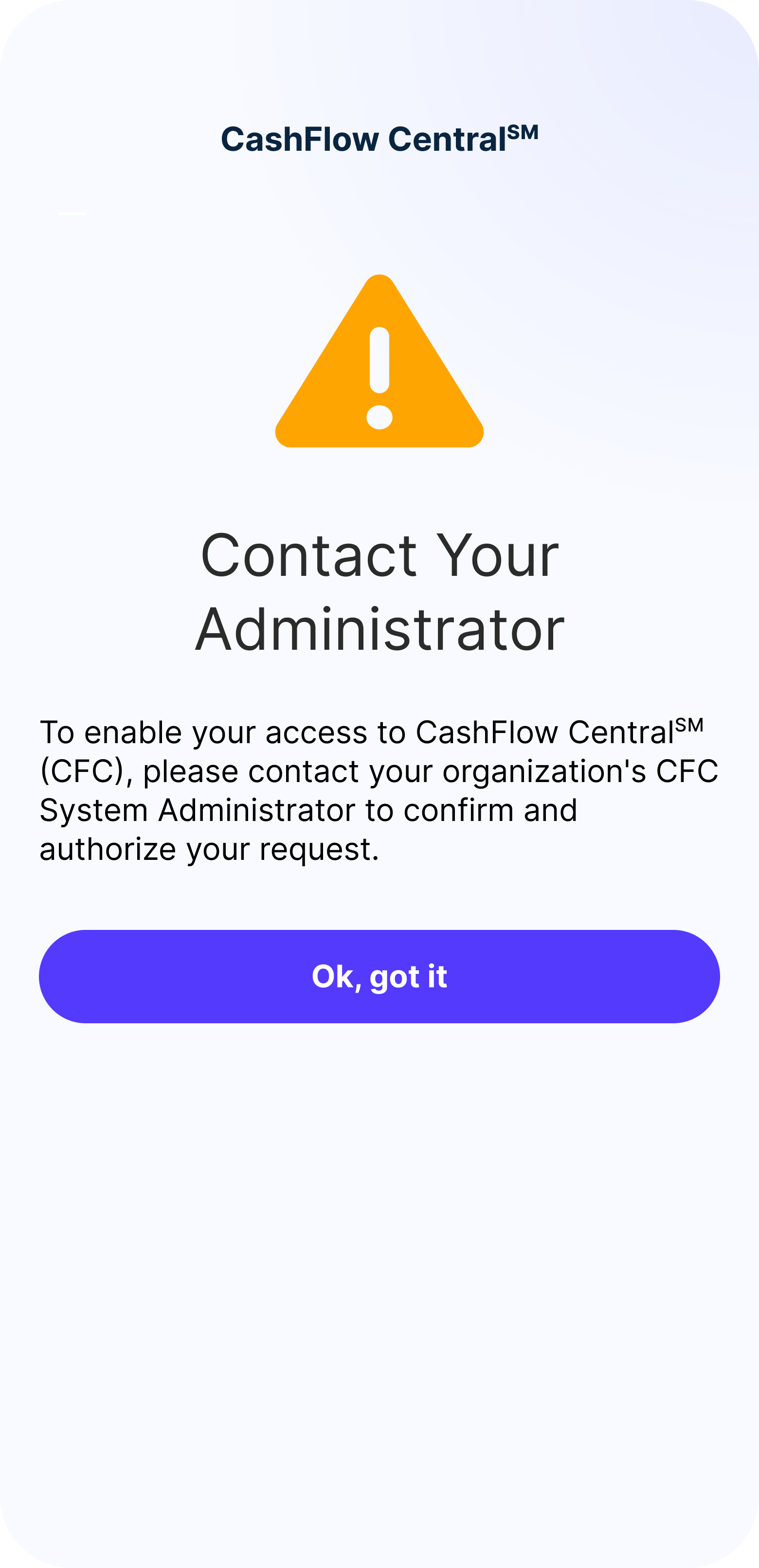
Pending · Contact Your Administrator
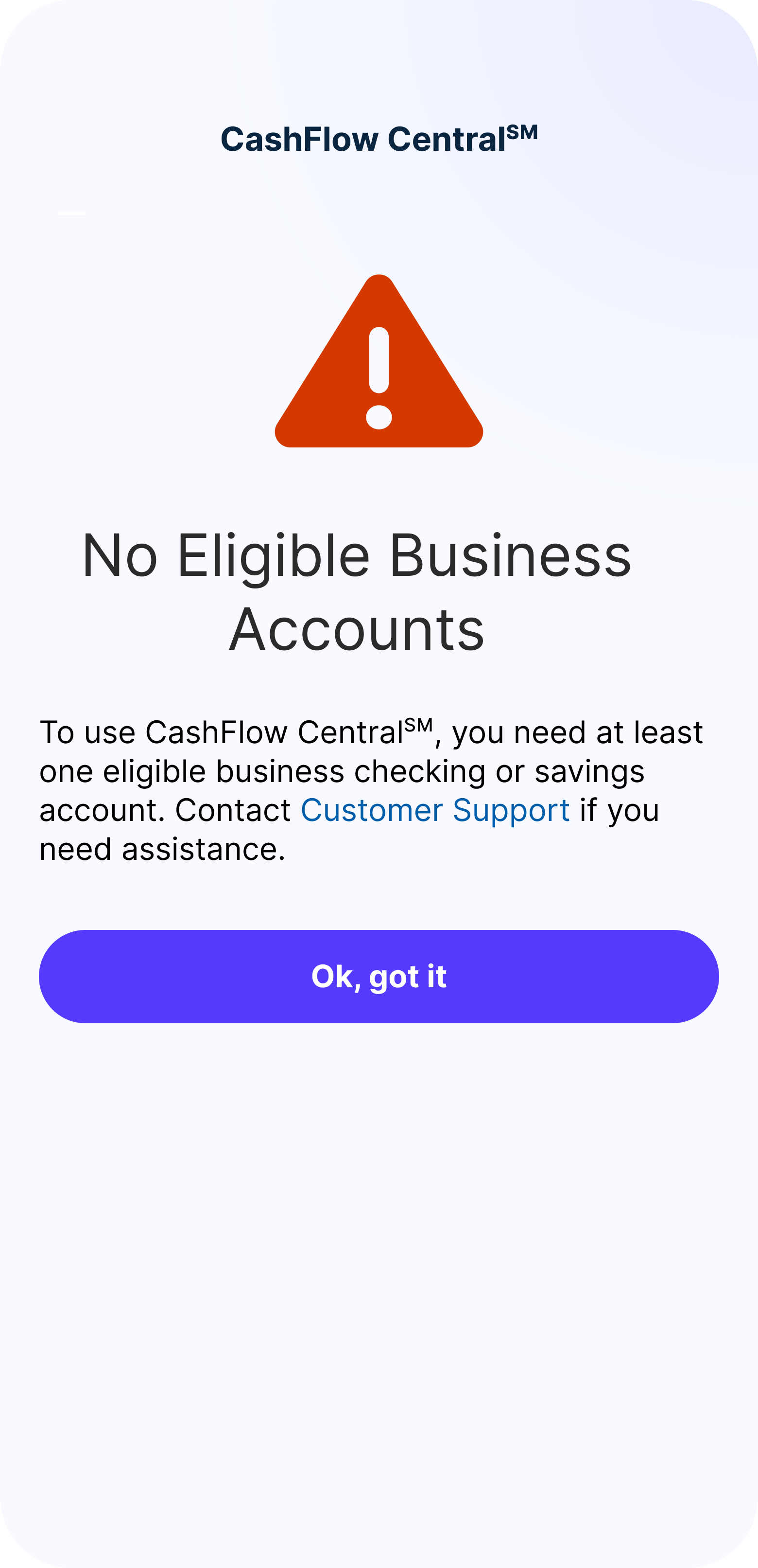
Ineligible · No qualifying accounts
Waiting for approval
Staff are signed up but the boss hasn't approved yet. Calm tone, warning icon — not an error.
Not eligible
Shown when there's no business account, or when staff try to sign up. Points them to support.
Account paused
A clear stop with a button back to the dashboard. No technical jargon.
Terms not signed
Staff can't access until the boss accepts the terms. Says so without exposing internal roles.
Email Touchpoints
A series of emails — launch, reminder, drop-off, welcome, and milestone — keeps people moving forward outside the app. All compliance-approved and written for East West Bank's bilingual customers.
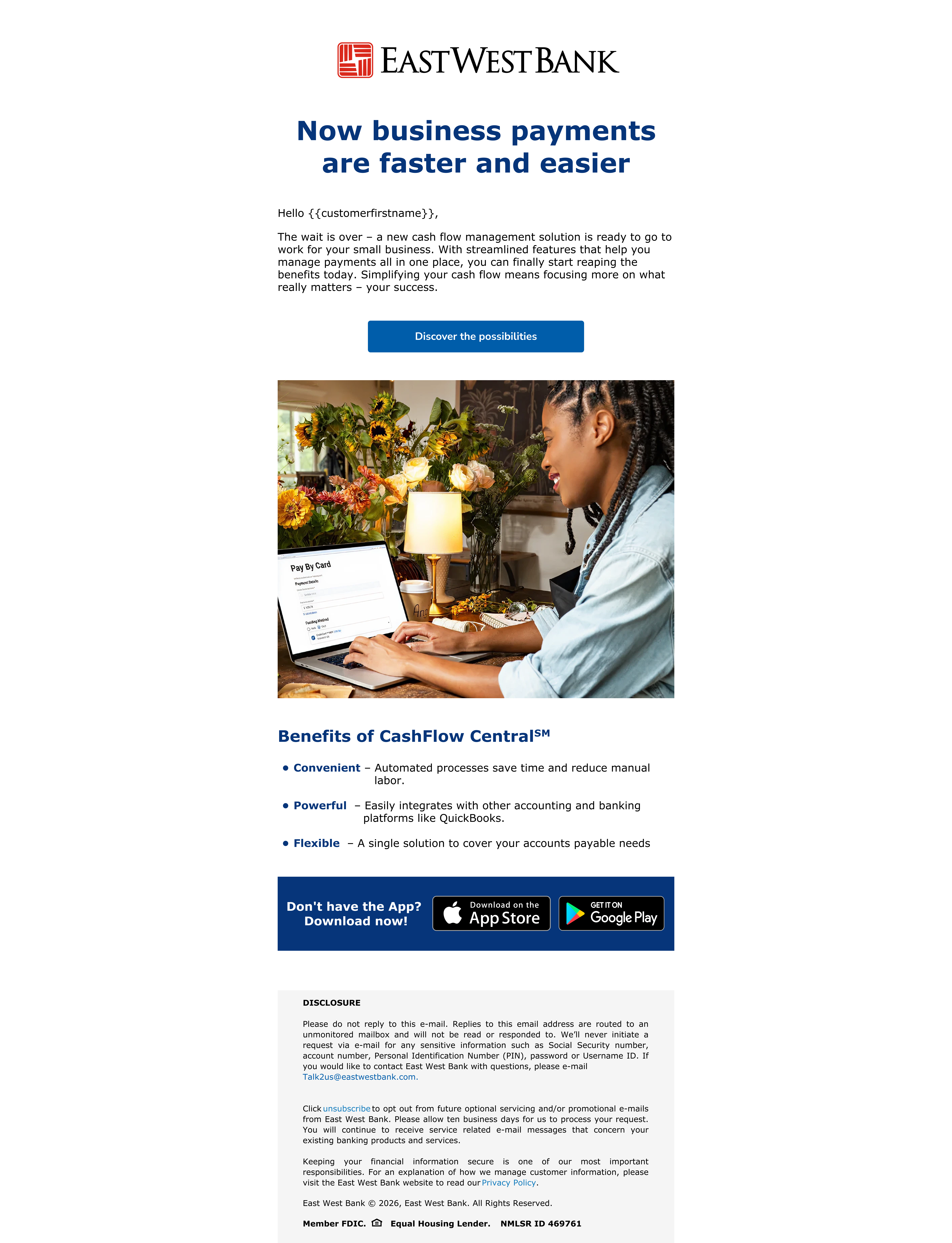
Campaign email · "Now business payments are faster and easier"
04 — Impact
CashFlow Central gave East West Bank's small business customers a tool they never had inside Velo. The full sign-up experience went from blank page to compliance-approved, build-ready design in one cycle.
The project also built a reusable pattern for adding outside products to East West Bank's app — making future integrations faster. And the two-phase rollout set a model for shipping in stages and learning as we go, instead of one big launch.
05 — Takeaways
In banking, the most important decisions aren't about how something looks. They're about how it's structured and the exact words on a button. Every dead-end screen chips away at trust in the bank.
Holding the design and the technical model in my head at the same time was hard. The API shaped what was possible — and knowing it well let me push for the right experience without asking for the impossible.
Compliance is a design partner, not a gatekeeper. Equal-weight terms buttons, up-front fees, plain-language errors — all got stronger because of compliance, not weaker.
Mapping decisions before drawing screens saved weeks. Every new edge case had a clear place on the map.
I'd test with real small business owners earlier — especially the pick-your-business step. It worked in review, but I think we could have made it lighter for people juggling several businesses.
I'd build a shared error-screen library with engineering from day one. We ended up designing errors as they came up, instead of mapping them all at the start.
And I'd push for A/B testing the landing page button. "Start using CFC" won, but "Get started" and "See how it works" were close. Even small wins compound over a quarter.